| Author | Thread |
Comments Made During the Challenge  |
|
|
03/27/2005 01:34:15 PM |
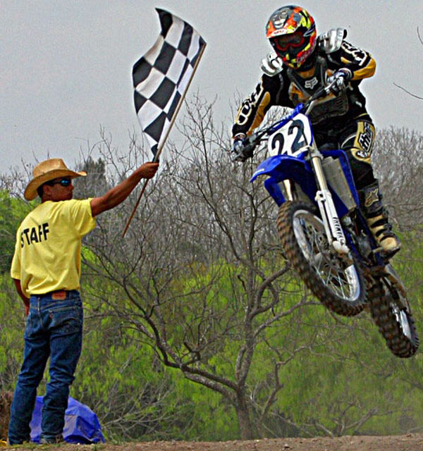
| Image could stand to be a bit sharper, but I really like the tight crop around all the elements in the image. It adds to the tension created by the fact that there's a dude on a motorcycle in mid-air. Nice work. (7) |
|
 Photographer found comment helpful. Photographer found comment helpful. |
|
|
03/25/2005 05:49:45 PM |
| Nice action, great color. You might try Neat Image to smooth some of the graininess in the sky. |
|
| Photographer found comment helpful. |
|
|
03/25/2005 10:11:11 AM |
| Would fit nicely on any page in a Sports magazine, well done! |
|
| Photographer found comment helpful. |
|
|
03/24/2005 07:17:37 PM |
| this image looks a little over editied. the reason i say that it because there is noise in the sky and the colors look too over processed. I think its just over-doing it on the post editing, everyone does it, i know i do. 6 |
|
| Photographer found comment helpful. |
|
|
03/23/2005 05:35:57 AM |
|
|
|
03/22/2005 08:12:43 AM |
| Great shot and no logos (key for stock images). |
|
| Photographer found comment helpful. |
|
|
03/21/2005 01:40:35 PM |
| I'm sure this was a very hard photo to capture - marks for that. However as a stock photo I think it is a little too pixilated and the focus not very sharp. There should have been a sharp focus on the biker and the rest of the image softer or the rest of the image sharp and the biker motion blurred. I think the focus rests somewhere between the two. Were you a distance away and this is a crop of the original photograph? |
|
|
|
03/21/2005 01:22:47 PM |
|
| Photographer found comment helpful. |
|
|
03/21/2005 11:45:50 AM |
| I wish the quality of your file was better, but good capture |
|
| Photographer found comment helpful. |
|
|
03/21/2005 07:04:18 AM |
|
| Photographer found comment helpful. |
|
|
03/21/2005 06:51:41 AM |
|
| Photographer found comment helpful. |
|
|
03/20/2005 09:36:26 PM |
| This certainly has a lot of potential, but it looks as though it was blown up quite a bit from the original, or maybe it was oversharpened a little too much. It just looks a little too contrasty. A once-over with NeatImage might help this one out a bit. - 6 |
|
| Photographer found comment helpful. |
Home -
Challenges -
Community -
League -
Photos -
Cameras -
Lenses -
Learn -
Help -
Terms of Use -
Privacy -
Top ^
DPChallenge, and website content and design, Copyright © 2001-2025 Challenging Technologies, LLC.
All digital photo copyrights belong to the photographers and may not be used without permission.
Current Server Time: 04/07/2025 09:00:11 PM EDT.