| Image |
Comment |
| 03/15/2005 08:32:17 PM |
|
 Photographer found comment helpful. Photographer found comment helpful. |
| 03/15/2005 08:31:43 PM |
|
| Photographer found comment helpful. |
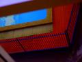
| 03/15/2005 02:01:13 AM |
Not seeing the big picture by octane202Comment: If only there was as much sharpness and contrast in the grass as there is in that cloud on the right I would have given it a 9, but there isn't so I gave it an 8. Nice shot. |
| Photographer found comment helpful. |
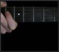
| 03/14/2005 01:59:15 PM |
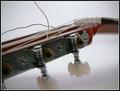
photo in A minorby saintaugustComment: Having the dark subject (the fret board) shot against the dark background doesn't help this shot. The fingers look a little lacking in detail and a softer brighter light source would have helped with this. |
| Photographer found comment helpful. |
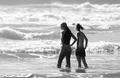
| 03/14/2005 01:57:19 PM |
To swim or not to swimby pgattComment: This shot is confused by several elements. Firstly the lower left corner and the top left of the frame where the blurred foreground should have been cropped out. The over saturation of the colors makes the pool fence and the wooden area hard to recognise. |
| Photographer found comment helpful. |
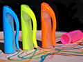
| 03/14/2005 01:54:40 PM |
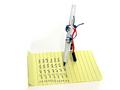
That darn pink!by okiesisiComment: Reasons I scored this a 3:
A lot of color noise giving it an overly grainy feel for a color shot.
The distracting black background against the white foreground is too much for the subject to make an impact.
The lines on the paper have almost no impact other than to make the shot look cluttered - am I looking at the lines or the marker lids?
The pink lid is almost out of shot.
You could have inceased the aperture to a higher number (like f22) to get a greater DOF, thus making all of the lids in focus.
What I liked: the vivid color - thats about it. |
| Photographer found comment helpful. |
| 03/13/2005 08:55:59 PM |
|
| Photographer found comment helpful. |
| 03/13/2005 08:16:08 PM |
|
| Photographer found comment helpful. |
| 03/13/2005 08:07:22 PM |
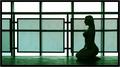
Meditationby BobsterLobsterComment: would have scored it higher with a brown or warm tone - the green is too...green...8. |
| Photographer found comment helpful. |
| 03/13/2005 08:05:25 PM |
|
| Photographer found comment helpful. |
Home -
Challenges -
Community -
League -
Photos -
Cameras -
Lenses -
Learn -
Help -
Terms of Use -
Privacy -
Top ^
DPChallenge, and website content and design, Copyright © 2001-2025 Challenging Technologies, LLC.
All digital photo copyrights belong to the photographers and may not be used without permission.
Current Server Time: 04/07/2025 10:12:20 PM EDT.