| Author | Thread |
Comments Made During the Challenge  |
|
|
03/19/2005 01:48:00 PM |
| kind of a hectic photo and oversaturated. |
|
 Photographer found comment helpful. Photographer found comment helpful. |
|
|
03/19/2005 10:51:49 AM |
| Subjects are out of focus,4 |
|
| Photographer found comment helpful. |
|
|
03/17/2005 06:14:08 PM |
| I love bright colors, and these are bright. Nice idea, just a little noisy |
|
| Photographer found comment helpful. |
|
|
03/16/2005 07:09:41 AM |
| Is that a reflection in the bg? Not sure; it's a bit distracting. Good concept, but I don't understand the shot. Sorry. 7 |
|
| Photographer found comment helpful. |
|
|
03/16/2005 05:12:45 AM |
| Seems unneccesarily noisy for a simple composition, and is a bit chaotic in it's placement of elements. |
|
| Photographer found comment helpful. |
|
|
03/15/2005 12:42:19 PM |
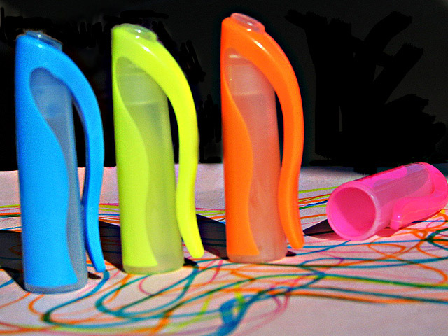
| Awesome job. i like how you used the highlighters on the paper first! nice title to go with the picture! |
|
| Photographer found comment helpful. |
|
|
03/15/2005 12:00:53 PM |
| looks a bit out of focus and/or noisy, nice idea though |
|
| Photographer found comment helpful. |
|
|
03/14/2005 01:54:40 PM |
Reasons I scored this a 3:
A lot of color noise giving it an overly grainy feel for a color shot.
The distracting black background against the white foreground is too much for the subject to make an impact.
The lines on the paper have almost no impact other than to make the shot look cluttered - am I looking at the lines or the marker lids?
The pink lid is almost out of shot.
You could have inceased the aperture to a higher number (like f22) to get a greater DOF, thus making all of the lids in focus.
What I liked: the vivid color - thats about it. |
|
| Photographer found comment helpful. |
|
|
03/14/2005 08:30:47 AM |
| Some of the grainy parts of this image are a bit peaky, but otherwise nice idea 7 |
|
| Photographer found comment helpful. |
|
|
03/13/2005 07:48:05 PM |
| The concept is ok, but everything is out of focus and too much clutter in the back. |
|
| Photographer found comment helpful. |
Home -
Challenges -
Community -
League -
Photos -
Cameras -
Lenses -
Learn -
Help -
Terms of Use -
Privacy -
Top ^
DPChallenge, and website content and design, Copyright © 2001-2025 Challenging Technologies, LLC.
All digital photo copyrights belong to the photographers and may not be used without permission.
Current Server Time: 04/07/2025 01:43:29 AM EDT.