| Image |
Comment |
| 06/26/2003 05:59:28 PM |
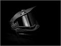
Shades of Paintballby RuchartComment: this is really well focused and framed, but i feel like the light is maybe just a little flat. i'd like to see some more contrast on the edges of the mask. 6. |
 Photographer found comment helpful. Photographer found comment helpful. |
| 06/26/2003 05:58:41 PM |
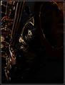
The allowed on DPC version :(by dimitriiComment: this is a very nice image. i'm not sure i understand the title, this being an "open-to-editing" challenge, but it looks like you've done some work on the border, which gives the photo a more grungy feel. i like the lighting, thought it seems a tad flat. i'm thinking now that maybe the "not allowed on dpc" version includes a more liberal crop, but i think this works just fine. 8. |
| Photographer found comment helpful. |
| 06/26/2003 05:53:48 PM |
3 Jacksby MusicmanComment: this has very poor focus. i understand the limitations of lower-end cameras, but maybe if you just backed off a bit you'd have been able to get a better focus lock on the jacks. the lighting and highlights seem pretty good, and maybe with a bit more work this would be an interesting shot. 4. |
| Photographer found comment helpful. |
| 06/26/2003 05:49:14 PM |
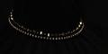
Black Pearlsby jillzComment: i can see where you are going with this shot, especially with the long crop, but ultimately it ends up being a little boring. good light and reflections, though. 5. |
| Photographer found comment helpful. |
| 06/26/2003 05:48:28 PM |
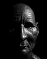
Dignityby PaulkComment: good lighting to highlight nice textures and forms. this is a well done shot, but i'm not a big fan of shots that use some other form of art as their primary subject. 6. |
| Photographer found comment helpful. |
| 06/26/2003 05:40:40 PM |
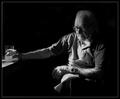
When all has been said and done by jjbeguinComment: this is a very nice shot. good light, good subject. really speaks a lot. my only minor gripes would be that it's not super sharp, which doesn't bother me all that much but seems to maybe detract from it in this medium (i'm sure it looks better printed), and the fact that it seems a tad grainy. other than that, very well done. 9. |
| Photographer found comment helpful. |
| 06/25/2003 01:10:18 PM |
Eternal Angelby ChrisW123Comment: very nice lighting and contrast. i think this really captures the essence of "low-key". the tree on the right keeps this image from being too centered, which i like. i'd love to see some more abstract, close-up, angled shots of this statue, because it has a lot of nice textures and tones to offer. good work. 7. |
| Photographer found comment helpful. |
| 06/25/2003 01:08:41 PM |
Loudby pitsamanComment: it's crooked. attention to detail can make or break a shot like this, and you've broken it. heh. decent lighting, good focus. i wouldn't mind seeing this with a shallower depth of field to maybe blur out some of the top of the speaker and give it a real sense of depth. 5. |
| Photographer found comment helpful. |
| 06/25/2003 01:07:34 PM |
lady with a shoulder drumby kenboComment: if this was a real human, this would be such a great shot. heh. the lighting and contrast is perfect, thought it does kind of border on being not really low-key. it's more of a straight on black and white. if the background were just a bit blacker, you'd be more into the low-key frame of mind (in my opinion). a good shot, nonetheless. 7. |
| Photographer found comment helpful. |
| 06/25/2003 01:06:06 PM |
Soulby KarenBComment: this has the makings of a really interesting shot. so many great surfaces and curves and highlights, but this image is really dark. i'd really love to see the lighting and contrast kicked up a notch to really bring out the subtleties of the instrument. 6. |
| Photographer found comment helpful. |
Home -
Challenges -
Community -
League -
Photos -
Cameras -
Lenses -
Learn -
Help -
Terms of Use -
Privacy -
Top ^
DPChallenge, and website content and design, Copyright © 2001-2025 Challenging Technologies, LLC.
All digital photo copyrights belong to the photographers and may not be used without permission.
Current Server Time: 04/09/2025 10:01:35 AM EDT.