| Image |
Comment |
| 01/18/2005 11:33:30 AM |
Avalancheby RHoldenSrComment: Can see what you are trying to do but the two elements are competing and there is too much white space. The trees in the background are not convincing or distinct enough. |
 Photographer found comment helpful. Photographer found comment helpful. |
| 01/18/2005 11:22:36 AM |
Harry Potterby photomayhemComment: There's another one similar but this one is harryer! Funny but not the greatest set up since that is a terra cotta pot. |
| Photographer found comment helpful. |
| 01/18/2005 11:12:59 AM |
The Birdsby pumaComment: I like it. Judging from all the spots though it looks like you need to have your sensor cleaned. You could also get rid of them in Photoshop. |
| Photographer found comment helpful. |
| 01/18/2005 11:08:03 AM |
CASINOby tfarrell23Comment: I would crop out the bottom so subject is not so centered. |
| Photographer found comment helpful. |
| 01/18/2005 11:06:19 AM |
|
| Photographer found comment helpful. |
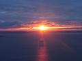
| 01/18/2005 11:00:44 AM |
In the Line of Fireby kaushikbaratComment: Horizon should be up or down --- never in the center --- I would show more of sky since it is more interesting. Same with boat and sun --- it is almost dead center. Putting it to the left would make it more interesting and give the boat space to move into. |
| Photographer found comment helpful. |
| 01/18/2005 10:57:08 AM |
|
| Photographer found comment helpful. |
| 01/18/2005 10:48:16 AM |
|
| Photographer found comment helpful. |
| 01/18/2005 10:47:31 AM |
|
| Photographer found comment helpful. |
| 01/18/2005 10:46:32 AM |
|
| Photographer found comment helpful. |
Home -
Challenges -
Community -
League -
Photos -
Cameras -
Lenses -
Learn -
Help -
Terms of Use -
Privacy -
Top ^
DPChallenge, and website content and design, Copyright © 2001-2025 Challenging Technologies, LLC.
All digital photo copyrights belong to the photographers and may not be used without permission.
Current Server Time: 04/07/2025 08:57:22 AM EDT.