| Image |
Comment |
| 01/03/2005 02:05:23 PM |
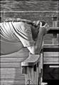
Distraughtby SDWComment: Why vertical crop? This image has such great midrange tones and focus a solid subject that could have been staged, but comes off as emotionally open (candid), but his body floats in mid-air into the picture. The stance of crouching like that would be more powerful with the bent knees to witness to his anguish. Some areas of highlight/blowout on the underarm area and one hot area in the water just above his head, the arms are not distracting, but the water dot is. Seems to need just a very tiny rotation clockwise, but otherwise a good shot. Leaving at 7. |
 Photographer found comment helpful. Photographer found comment helpful. |
| 01/03/2005 01:48:12 PM |
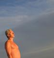
Serenityby Mark of SRQComment: Great use of the square crop. This could easily be staged, but comes off as relaxed and the light quality really lends to the sense of serenity. If more top sky was available in the orginal shot, would recrop just above/right at the belly button to force the subject into a solid left corner 3rd and a larger negative space, but that is not worth deducting for. 7 |
| Photographer found comment helpful. |
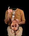
| 01/03/2005 01:44:50 PM |
Nap before the Showby jaredldrComment: This is a great shot, staged or no. It oozes father son relations and the DOF does its job very nicely. Perhaps a bit too much shadow in the shoulder/chest area. This area should not be muddied as the contact would be even more solidly portrayed. The hand position around the throat looks out of place, perhaps would clone that out. For now a 7. |
| Photographer found comment helpful. |
| 01/03/2005 01:41:20 PM |
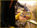
On the moveby nolockComment: This shot is intriguing. I am challenged to wonder how the blurred grass and motorcycle are in motion while the mirrored image is in perfect stop motion. Is this really a candid of the cyclist or those on the side of the road behind? The colors are strong and work well with the border but the subjects seem too small to be of any significance to the concept of candid. There is a minor distraction on the Left Top that should be cloned out.
Technically, this is an over the top interest factor and while the idea of snapping a shot of someone from through a mirror would be candid, some of the challenge validity seems lost in the inability to see those who have been captured in any detail. I will be interested to see/read how this was done without multiple images. |
| Photographer found comment helpful. |
| 01/03/2005 01:33:43 PM |
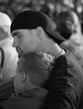
Tomby xtabintunComment: Tom looks befuddled. The combination of the white wall and shading of the blinds creates a perfect background for this shot. There is a very wide range of midtone shading and the whole appears in perfect focus. Careful attention to detail has ensured that no reflections in the lens or glasses cause any distraction. It is a strong image that would improve slightly by moving the subject off center slightly or even at an angle to add a variety of interest to the shot. This could easily have been staged, but appears relaxed enough to consider candid. Bumping to 8. |
| Photographer found comment helpful. |
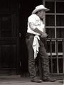
| 01/03/2005 01:28:23 PM |
Cowboy Cookby BAMartinComment: Dang LCD. Can never tell if it is the photo or the gamma, but the whites on this (hat and sleeve) appear too smoothed or blown out. On the other hand the depth of the midtones is very strong and this tends to balance out the shirt/door which are on the extreme. A very crisp image that could esily have been staged, but still appears quite candid and relaxed. Despite the shoulder and hat, I'm bumping this to an 8. |
| Photographer found comment helpful. |
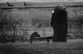
| 01/03/2005 01:25:25 PM |
Sweet Embraceby redmoonComment: A good candid that has the potential for art. It is hindered by the short DOF on the fence nearest to the couple and the dark tone. A bit more width in the midrange would go a long way to giving this image that extra oomph to push it into the 8-9 range. The bench behind the wall seems like it should be cloned out. |
| Photographer found comment helpful. |
| 12/23/2004 04:29:06 PM |
Doggie Heavenby CamComment: Very cool shot!
Can even see a rampant horse on the left side of the dog body! |
| Photographer found comment helpful. |
| 12/20/2004 02:52:57 AM |
|
| Photographer found comment helpful. |
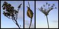
| 12/18/2004 04:00:55 AM |
Winterby thatcloudthereComment: Very honest and well thought out critique. You're right, the lighting of the weeds is too dark, but you can overcome that with the fill flash on a very low setting. At the risk of blasphemy, I would also mirror image the one on the right to help balance out the shot.
You have done very well in balancing the weight of each individual frame and that is half the battle. I am not sure I know what you mean by the stem comment as I find the stem size vs main subjects to be very good. More stem might require a much heavier border set to bring it back into perspective. |
| Photographer found comment helpful. |
Home -
Challenges -
Community -
League -
Photos -
Cameras -
Lenses -
Learn -
Help -
Terms of Use -
Privacy -
Top ^
DPChallenge, and website content and design, Copyright © 2001-2025 Challenging Technologies, LLC.
All digital photo copyrights belong to the photographers and may not be used without permission.
Current Server Time: 04/19/2025 01:00:21 AM EDT.