| Image |
Comment |
| 06/16/2003 04:16:10 AM |
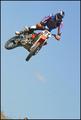
Rarified Airby ToddhComment: o.k. I just have to ask the question...why did you leave inthe kids head? i'm thinking you wanted a drop of land for perspective, but it will get lower scores because of the half of a head.
Excellent focus, colors and stopped motion on this. |
 Photographer found comment helpful. Photographer found comment helpful. |
| 06/11/2003 02:39:15 PM |
whispers and giggles by ursulaComment: Congrats on a beautiful shot. The emotion is quite strong. My only negative comment, which no one mentioned, is that you have oversharpened this. I tried adding smart blur and despeckle and it helps. You should also tone down the contrast a touch and boost the brightness a little, too take the focus away from her hand. I know you won a ribbon and might ask why I am giving negative comments, but I think these slight changes would make it "perfect". |
| Photographer found comment helpful. |
| 05/27/2003 04:40:38 PM |
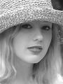
Whitneyby draney4Comment: beautiful model..you probably wanted the softness, but I would have preferred if the focus was on her more than the hat(maybe a closer crop). Whites are a little blown out, and you could use a little more dark tones. |
| Photographer found comment helpful. |
| 05/27/2003 04:26:55 PM |
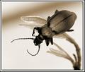
Beatleby JackoComment: excellent macro...focus is great, as is composition, and contrast. |
| Photographer found comment helpful. |
| 05/23/2003 06:35:46 PM |
|
| Photographer found comment helpful. |
| 05/23/2003 06:33:36 PM |
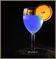
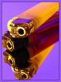
A Good Mixby RuchartComment: I love the color of the liquid and the orange. I don't like the light on the material below the glass-it gives to much attention to it. There is also too much going on on the left top of the glass. I would also try centering the glass or lining it up on the 2/3 line with the orange on the inside. This might balance the photo better. |
| Photographer found comment helpful. |
| 05/23/2003 06:27:07 PM |
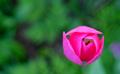
In Low Earth Orbitby magnusComment: interesting abstract...I would prefer a little sharper focus on the main subject, although I can see you intended it to be this way. The blueish color to the right of the flower is a little distracting. The colors don't match the challenge though. |
| Photographer found comment helpful. |
| 05/23/2003 06:22:59 PM |
Yellow and Purpleby CLarson557Comment: Very nice composition. I would prefer a sharper focus on the top one. The yellows appear to be orange though. |
| Photographer found comment helpful. |
| 05/19/2003 06:54:43 AM |
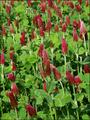
Roll me over in the clover~by justineComment: for a shot like this you needed a much shorter DOF. My eye has nothing to stop at, it needs a main focus. Lighting is a little too strong. |
| Photographer found comment helpful. |
| 05/19/2003 06:53:10 AM |
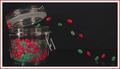
The Great Escape by wayne9232Comment: cute shot..let me see if I can figure it out...picture taken of the jar first. Then jelly beans on glass over the picture? hmmmm...am I right?
Anyway, very original. would have liked the colors in the jar a drop brighter. I would have darkened the black also. |
| Photographer found comment helpful. |
Home -
Challenges -
Community -
League -
Photos -
Cameras -
Lenses -
Learn -
Help -
Terms of Use -
Privacy -
Top ^
DPChallenge, and website content and design, Copyright © 2001-2025 Challenging Technologies, LLC.
All digital photo copyrights belong to the photographers and may not be used without permission.
Current Server Time: 04/09/2025 05:35:22 AM EDT.