| Image |
Comment |
| 03/15/2004 05:04:56 AM |
Jenniferby EddyGComment: The color is great. The light on the hair is also great.
I think I'd prefer a less stiff pose though, but thats just me :) |
 Photographer found comment helpful. Photographer found comment helpful. |
| 03/15/2004 05:02:04 AM |
|
| Photographer found comment helpful. |
| 03/15/2004 05:00:46 AM |
Taylor Marieby PaigeComment: I would have prefered this with a solid t shirt. The shirt takes some attention away from the subject. |
| Photographer found comment helpful. |
| 03/15/2004 04:58:17 AM |
Kidnapped Radianceby frumoazniculComment: composition and expression are great. I am all for different approaches to color, but the color under the eyes just doesnt do it for me. Would love to see this with a different color combination. |
| Photographer found comment helpful. |
| 03/08/2004 02:30:14 AM |
Gotta light? by kiwinessComment: Congrats Gary!
I guess you picked the right challenge to come back for.....you are on FIRE! |
| Photographer found comment helpful. |
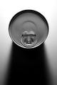
| 02/24/2004 01:25:41 PM |
canby fannybComment: The jagged edges are very obvious. It would keep me from going higher than 6 or 7. |
| Photographer found comment helpful. |
| 02/17/2004 09:09:41 AM |
|
| Photographer found comment helpful. |
| 01/19/2004 06:30:22 AM |
|
| Photographer found comment helpful. |
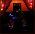
| 01/16/2004 02:19:50 PM |
Light Infinityby RoosterComment: From the critique club:
I really like the idea here.
The action is good, it certainly meets the challenge.
Some things that I would change though...
the background is distracting. The picture frame(?) and crocked black line are distracting and take my eye away from the subject.
I'm not sure if you used a tripod here, but the background looks a little blurry which would indicate you might not have.
A tripod and shorter exposure maybe would have helped.
It was a cool, original idea though.
Terry
|
| Photographer found comment helpful. |
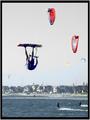
| 01/16/2004 01:42:59 PM |
Kite Surferby JaxsonComment: From the critique club:
Here are the positives...
It certainly meets the challenge.
The horizon is straight.
The composition(rule of thirds)and cropping are good.
Here are the negatives...
The color seems off, the main surfer looks too blue in his skin.
The photo is slightly too busy. With all the sails(?) in the sky, my eye has trouble finding the important parts.
Lighting on the main subject could be better.
Terry |
| Photographer found comment helpful. |
Home -
Challenges -
Community -
League -
Photos -
Cameras -
Lenses -
Learn -
Help -
Terms of Use -
Privacy -
Top ^
DPChallenge, and website content and design, Copyright © 2001-2025 Challenging Technologies, LLC.
All digital photo copyrights belong to the photographers and may not be used without permission.
Current Server Time: 04/09/2025 05:31:38 AM EDT.