| Image |
Comment |
| 05/19/2003 10:28:57 PM |
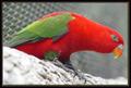
I'm watching youby MusicmanComment: This bird has a lot of presence and the title is very à propos because he and i are constantly making eye contact. Colors of the bird are fantastic, so is the clarity. A little unfortunate is that the color of the perch is pretty much washed out and that the cage lines are stronger than would have been ideal; it competes a little with the bird for attention. But something has to give, i guess. 8 |
 Photographer found comment helpful. Photographer found comment helpful. |
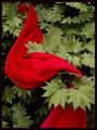
| 05/19/2003 10:19:27 PM |
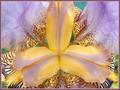
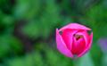
Fanfareby kavamamaComment: This image is troublesome to me and i'll tell you why. These colors here clash, or in any case aren't particularly pleasing to my eye. And yet, i bet, that in reality this flower is just beautiful as i have never seen a flower that is not beautiful in its own way of perfection. The yellow and the mauve of the center petals are beautiful, the rest reads as 'too busy' for me. Maybe what accounts for my discomfort is that it was taken out of context and the overall look isn't softened by quiet leaves. The dof on the top mauve petals adds to this feeling of busy-ness. 7 |
| Photographer found comment helpful. |
| 05/19/2003 10:13:14 PM |
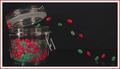
The Great Escape by wayne9232Comment: How long have you been practising to get the jellybeans into the container? :) I really like how clean this image is. Great lighting. Great composition and the trajectory of the beans is well staged and give life to this image (otherwise, i don't give a hoot about imagery of jelly beans :) Fun image 8 |
| Photographer found comment helpful. |
| 05/19/2003 10:07:19 PM |
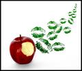
Stolen Kiss by dsidwellComment: I have seen stuff like this before; yet, it's fun. Nice composition. That apple looks so good that i'm very tempted to take a bit from it as well. Very clean image. I like square presentations! 8 |
| Photographer found comment helpful. |
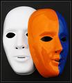
| 05/19/2003 10:04:42 PM |
Mask paradeby AnastasiaComment: This image is stark and striking. Great colors; great composition. This has impact for me; like mask imagery anyway. Artistic shot 9 |
| Photographer found comment helpful. |
| 05/19/2003 10:01:13 PM |
Her red silk scarfby jjbeguinComment: Very nice color combination and even though a scarf isn't normally draped around a tree, it doesn't have a contrived feel. Could be a nice cover for a mystery novel. I do like the green leaves because they have this aura of surrealness because of their low saturation. Wonder whether you did that in photoshop? Nitpick: the only thing i would have eliminated somehow is the tips of a number of leaves on the left edge just above the scarf. 8 |
| Photographer found comment helpful. |
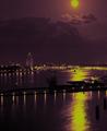
| 05/19/2003 09:57:44 PM |
Moonlight over the harborby johnmkComment: For some reason, this makes a 16th century impression on me. The purple and also the yellow/gold of the image is very striking. Wonder whether that was in-camera or from photoshop; doesn't really matter to me. It has a very pleasing, mysterious effect. Love that light cloud on the top of the image. The only thing i don't like,and would have cropped it out, is the moon. Would have cropped the image right below. But you will probably get lots of comments raving about this moon. Also see some banding from compression. Very nice. 9 |
| Photographer found comment helpful. |
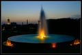
| 05/19/2003 09:51:16 PM |
Glow!by paganiniComment: Just wondering: have i seen that fountain, and those towers as a matter of fact, before? Like the subdued colors of the evening sky, seemed to have some LA smog. Colors are very rich and warm. The left half of the image is superb because it has a wonderful composition with the towers and the dispersion of lights. The right half is a bit dark because of the dark building sitting there without any further height differences. Could you have taken it standing to the right of this fountain, just focusing on the left half of the scene here? Just a nitpick and my opinion: that 1 px white border might have looked better if it had been the yellow-gold in the tower. That white doesn't appear anywhere in the image and it's so commonplace. 8 |
| Photographer found comment helpful. |
| 05/19/2003 09:39:21 PM |
In Low Earth Orbitby magnusComment: I really like this image a lot. Yes, i can clearly see it is a flower but thanks to your capture from above it has also assumed another appearance, as your title aptly points out. I love to see flower picture; in last week's challenge there were tons of them. By now, i am pretty much saturated of the accurate documenting of 'pretty' flowers and flowers need to be done with a different take, in an original matter, to make impact on me. This was does that. Beautiful rich colors of the flower. Don't even know whether it is a tulip or what and i really don't care. I like the simplicity of the image and i also appreciate originality. 9 |
| Photographer found comment helpful. |
| 05/19/2003 09:33:00 PM |
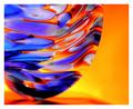
The Cosmic Vase at Sunrise :)by ursulaComment: Sunrise, my foot! :) Anyway, really well done. Like the tonality of your background 'sunrise' and how it fuses with the colors of the vase. Like the dof of what's that the base of the vase or its shadows. Beautiful colors. Really has a very pleasing, dynamic impact. Is your whole house in this cosmic vein? :) 9 |
| Photographer found comment helpful. |
Home -
Challenges -
Community -
League -
Photos -
Cameras -
Lenses -
Learn -
Help -
Terms of Use -
Privacy -
Top ^
DPChallenge, and website content and design, Copyright © 2001-2025 Challenging Technologies, LLC.
All digital photo copyrights belong to the photographers and may not be used without permission.
Current Server Time: 04/09/2025 05:31:36 AM EDT.