|
|
| Image |
Comment |
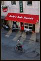
| 05/25/2003 10:10:31 AM | Simpler Timesby crabappl3Comment: Crabappl3, i like pictures like these a lot. To me, there's something 'classic' about them; i call them Vittorio de Sica Bicycle Thieves type of pictures (that's an old movie from the 50s and if you have never seen it, recommend watching it if you ever have a chance). My suggestion would be to simplify this further and cropping it out somewhere near the top of the red awning. That would get rid of the clutter of the coca cola sign, and the awkward partial Ques (antiques?). Would also crop off the edge of the building to the right. Then, you end up with a much stronger picture that emphasizes the expressive asphalt. Moreimportantly, it also emphasizes the relationship between the bicyclist, the reader, and the legs of the advertising model. What fascinates me about this picture actually is the NON-relationship between these three: even though they are all operating in the same picture plane and small space, they are all entirely uninvolved with one another. It's a great indictment of the human condition in modern society.
Just want to say that i like your pictures in general a lot. Often, i may not comment on them but they are good scores from me. Also like your range in photographic subjects and moods, ranging from the highly creative to the very sensitive. |  Photographer found comment helpful. Photographer found comment helpful. |
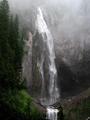
| 05/25/2003 08:04:02 AM | Comet Fallsby paganiniComment: Beautiful capture of nature. The mist really does it for me. I might prefer the duotone rendition of this if you had used THIS crop for it as my eye loves that water on the bottom spilling over the edge and misses that in the duotone version. Although i like the mystery in the duotone version it seems indeed just a tad too flat. I would have liked either version of this but now that you have shown both, i can't quite settle on either one. As is, i prefer this color rendition. | | Photographer found comment helpful. |
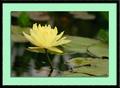
| 05/25/2003 07:46:48 AM | Rise Aboveby paganiniComment: Beautiful. Like how the leaves border between the representational and the abstract. With this flower, being very formal and symmetric, i agree with your perfect flower theory. But not with all flowers! This image is tough to see though because of the green mat. If you're open to suggestions, you might play for the mat with something like a9a6aa, mauvish grey, or 888986, darker grey. (Yup, i looked at it in PS7 but then deleted the file as normally i do not steal other people's stuff). Q: why do you end up with such small file sizes; noticed that on the orange flower as well? | | Photographer found comment helpful. |
| 05/21/2003 12:42:09 PM | Impressionist canvasby GordonComment: Paganini, it is perfectly acceptable that you don't like this shot or any shot. You don't like the shallow dof, fine. Half your comment though was about the flower being imperfect and hence, according to your thinking, an undesirable model. I like to see nature 'as is' and yes, i realize that once you reduce it to 640px by something px it isn't any longer nature as is because you have already taken it out of its natural context. I just don't like that everything needs to be anti-septically perfect. I see great beauty, and symbolism, in wilted flowers and they used to be one of my favorite subjects.
What i dislike about your comment, and in so many others of dpc voters, is that dwelling on the negative. With this picture i sensed, right or wrong, that someone was looking for a personal vision, beyond shooting things as usual. That, to me, is much more important than a flaw here or there. I detected the same with your Loyal Worker, which is still my all time favorite shot but if you want me to, i can point out a couple of flaws there as well :)
Best of luck finding your Heidi Klum, be it in the flesh or in a flower :) | | Photographer found comment helpful. |
| 05/21/2003 07:47:51 AM | Impressionist canvasby GordonComment: Paganini, hope you revisit this picture because i like to say that i radically disagree with your assessment. Of course, just like everyone else you are entirely entitled to your own opinion :) Don't know why i even say that because of all people you don't need reminding of that ;) You object that the focus flower has broken stems (petals?). But you know what? That's NATURE. I like to see nature not an ANTI-SEPTIC man-made 100% perfect rendition of it to suit a photograph glossy. I like to see the 'flaw', the 'oddity' in nature because despite that whatever is real nature always happens to be incredibly harmonious. Nature really is the master artist of all.
Judging from your voting comment, what you are after, paganini, is a Hollywood, Heidi Klum version of nature. (glad i could toss this in :) But real nature is so much more beautiful and interesting than the made-over Heidi Klums. Total perfection ends up being BORING.
The reason i like this image so much is because the focus flower(s) is (are)in focus but just barely, just barely, just barely, and hence it blends in so harmoniously with the shallow dof other flowers. Message edited by author 2003-05-21 11:56:57. | | Photographer found comment helpful. |
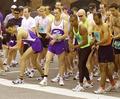
| 05/20/2003 08:43:35 PM | The Raceby GolferDDSComment: Oh boy, did you get screwed here with the score. Good thing those scores don't mean a lot! Can't believe that people call this a snapshot!
What WOULD they expect to see from a picture of runners getting ready for a race? That they would prettily pose for the photographer? Anyway, you captured the moment and the action. Be pleased! | | Photographer found comment helpful. |
| 05/20/2003 08:34:05 PM | Impressionist canvasby GordonComment: Congrats, Gordon. Thought this image was stunning. It IS stunning! Am getting a little tired of seeing pretty flowers 'documented'. This goes way beyond that. I believe i said something like that in my initial comment but thought it wise to edit it. I believe it was my only 10. | | Photographer found comment helpful. |
| 05/19/2003 10:39:38 PM | Come Togetherby friscaComment: Nice image, symbolic but also mildly sexy. The blue female hand is infinitely more expressive, which helps this image a lot, than the orange male hand. The orange hand seems just the result of a color filter or hue sat; it might have been more interesting if it had been painted as well. The light falling on the female hand is also more interesting than that on the male. 7 | | Photographer found comment helpful. |
| 05/19/2003 10:34:31 PM | Reflectionsby mbardeenComment: Nice image with strong lines and intense colors. Good composition. 7 | | Photographer found comment helpful. |
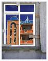
| 05/19/2003 10:32:37 PM | New house on the blockby JeanComment: Like this image; it has a lot of atmosphere. Two different worlds or eras are represented here in this small image and that makes for a lot of impact. The dull greys of this building are a nice foil for the intense blues and oranges of the reflections. Great how well the reflections have been handled. 8 | | Photographer found comment helpful. |
Home -
Challenges -
Community -
League -
Photos -
Cameras -
Lenses -
Learn -
Help -
Terms of Use -
Privacy -
Top ^
DPChallenge, and website content and design, Copyright © 2001-2025 Challenging Technologies, LLC.
All digital photo copyrights belong to the photographers and may not be used without permission.
Current Server Time: 04/09/2025 05:35:23 AM EDT.
|