| Author | Thread |
|
|
05/25/2003 02:10:31 PM |
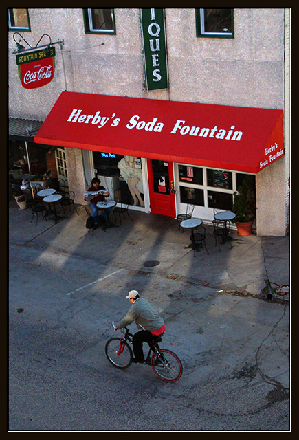
Crabappl3, i like pictures like these a lot. To me, there's something 'classic' about them; i call them Vittorio de Sica Bicycle Thieves type of pictures (that's an old movie from the 50s and if you have never seen it, recommend watching it if you ever have a chance). My suggestion would be to simplify this further and cropping it out somewhere near the top of the red awning. That would get rid of the clutter of the coca cola sign, and the awkward partial Ques (antiques?). Would also crop off the edge of the building to the right. Then, you end up with a much stronger picture that emphasizes the expressive asphalt. Moreimportantly, it also emphasizes the relationship between the bicyclist, the reader, and the legs of the advertising model. What fascinates me about this picture actually is the NON-relationship between these three: even though they are all operating in the same picture plane and small space, they are all entirely uninvolved with one another. It's a great indictment of the human condition in modern society.
Just want to say that i like your pictures in general a lot. Often, i may not comment on them but they are good scores from me. Also like your range in photographic subjects and moods, ranging from the highly creative to the very sensitive. |
|
 Photographer found comment helpful. Photographer found comment helpful. |
|
|
03/24/2003 04:44:20 PM |
Greetings from the Critique Club :)
Hi Crab...
The challenge is nicely met here with the 'from above' view. The composition is fine. The exposure looks just a tad on the flat side though. Looking at your settings, I would assume that the image may be underexposed by about one stop or so. A slightly longer exposure (one more stop using 1/400" or so) would possibly increase the saturation on the red in the photo quite a bit. The red awning is showing up some amount of noise and i'm not sure where that is coming from. It could be underexposure, but more likely from post processing on the hue or saturation channel.
This image looks more like a 'per chance' photo than something that you planned... Understanding that, I believe that a different time of day may highlight this scene a little more. Planning for the bicycle rider had to be impossible, but a slightly longer exposure on that issue to create a little motion blur with the rider could have created a really nice piece of eye candy in this photo...
Keep up the good work :)
John Setzler
|
|
| Photographer found comment helpful. |
Comments Made During the Challenge  |
|
|
03/23/2003 09:16:26 PM |
| Good motion. Red really stands out. |
|
| Photographer found comment helpful. |
|
|
03/23/2003 06:06:07 PM |
| Great shot -- almost does indeed take the viewer back to days gone by! I like how you caught the guy with the bike in the shot -- it really reinforces the whole theme of the photo. |
|
| Photographer found comment helpful. |
|
|
03/23/2003 05:07:57 PM |
| Very nice. You've captured a nice piece of quiet city life in this well composed image. Everything works for me. 10 (one of 3 for me this week) |
|
| Photographer found comment helpful. |
|
|
03/22/2003 09:24:03 PM |
| I do on tknow why but I like the simplicity of this shot. Simple and qiuet. I like it The only thing I do not like but I guess you could not do different is the green vertical sign cut. Usually if there is a word somewhere it's better to have it fully in the picture. Less important in that case as the sign is vertical. Nice photo. 7. Lionel |
|
| Photographer found comment helpful. |
|
|
03/22/2003 06:37:18 PM |
|
| Photographer found comment helpful. |
|
|
03/21/2003 08:48:08 PM |
| I'd have liked this antiqued - either sepia or grainy BW. OK, I like it anyway. good shot. |
|
| Photographer found comment helpful. |
|
|
03/21/2003 02:43:31 AM |
| Hey this is cool! Did you arrange that guy to be riding by on a bike with red on it, and he even has a red shirt tail hanging out? That's too freakey to be coincidence. Come on, tell the truth now! |
|
| Photographer found comment helpful. |
|
|
03/20/2003 10:45:51 PM |
| Great shot -- you really caught the mood and atmosphere of the street here. |
|
| Photographer found comment helpful. |
|
|
03/20/2003 12:31:36 PM |
Composition is good, Great photo for the Challenge.
Visual impact is pleasant feast to the eyes. Focus is good, Lighting
is great with some fine natural shadows, Color are nice and bright.
|
|
| Photographer found comment helpful. |
|
|
03/19/2003 09:27:48 AM |
| Just when I began to wonder about this weeks enteries I find this. Not only does it give the feel of being taken from above looking down...it's art. This is worthy of a print ! = 10 |
|
| Photographer found comment helpful. |
|
|
03/18/2003 02:37:05 PM |
| nice image, creative idea |
|
| Photographer found comment helpful. |
|
|
03/17/2003 07:26:48 PM |
| Great snap shot, esp, the red tonality. Good job |
|
| Photographer found comment helpful. |
|
|
03/17/2003 09:25:27 AM |
| This is one of my few favourites this week, it seems you were in the right place at the right time! I see six or seven instances of red in this image and they are almost all the same shade, good capture, excellent, 10 from me. |
|
| Photographer found comment helpful. |
|
|
03/17/2003 01:58:23 AM |
| The more I look at this, the more I like it. I was going to give it average thinking that it should have been in B&W. But the red Coke sign, the red (whatchamacallit over the shop) the door, and even the red fork on the bike, make it above ordinary. :) 7 |
|
| Photographer found comment helpful. |
Home -
Challenges -
Community -
League -
Photos -
Cameras -
Lenses -
Learn -
Help -
Terms of Use -
Privacy -
Top ^
DPChallenge, and website content and design, Copyright © 2001-2026 Challenging Technologies, LLC.
All digital photo copyrights belong to the photographers and may not be used without permission.
Current Server Time: 02/01/2026 12:00:46 PM EST.