| Image |
Comment |
| 04/25/2005 02:23:33 PM |
Silver Heart Earringsby postoakinversionComment: Very nice and sharp eyes. The idea of the eyes and earing to be the only 'sharp' parts of the picture very interesting, unfortunatly i do not feel it works very well, as most of the subject of the picture isn't the jewel. A tighter crop of perharps only one side of the face and the earing could've worked as much. Frame is nice and classic, which makes the picture work more. 5 |
 Photographer found comment helpful. Photographer found comment helpful. |
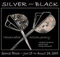
| 04/25/2005 02:22:13 PM |
Silver on Blackby Bear_MusicComment: Wierd suggestion of composition. I feel overwhelmed with information which in an advertisement picture, isn't too good (leave that for the part where there is actual text in a magazine for exemple). Lighting is a little stale, but works with the contrast work. LOts of touchups could've avoid all the little grains and grey spots all around the item. The change in colours of the text is not very appealing either. 5 |
| Photographer found comment helpful. |
| 04/25/2005 02:20:18 PM |
midas jewellersby naomikComment: Composition is good. Touchups are awful, unfortunatly. I can see all the work done in the left ring and on the left side of the picture. Which also brings me to believe there is 'over'paint, which is against the advanced rules. Lighting is good, if only a little overdone, which splashs the items a bit too much (did you use a soft box?). Also the Font used is nice, but the colour is way too strong for the items (using the colour picker tool could've helped in selecting a colour more interesting and closer to the rings). Composition could also be a lot tighter with this shot. 4 |
| Photographer found comment helpful. |
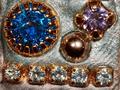
| 04/25/2005 02:01:55 PM |
Gemsby photogenixComment: Nice colours, unfortunatly very splashed by lighting which is not very good. (Angle and force). The composition is somewhat stale and not very interesting to look at and we don,t really see what those things are for... 4 |
| Photographer found comment helpful. |
| 04/25/2005 02:00:48 PM |
Give Her Beaded Elegance in Turquoiseby joyinlightComment: Slightly wierd composition here. the DOF could've been better as well, since even tho the portrait is nice, its a bit out of focus in the middle of the face. Colours could be punched some more and the item displayed could use lots more sharpness and contrast. 5 |
| Photographer found comment helpful. |
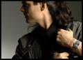
| 04/25/2005 01:59:48 PM |
OUTBACKby DrJOnesComment: Very nice Ad! Composition is appealing and strong. I can feel the energy and attitude of the 'trekker' as he moves away. Nice look on his face as well. Lighting is cool, if only a tiny bit too directional. The choice of grey background is a good idea as it gives the watch more power as well. I'd wished for a slightly 'closer' shot since we don't see the watch that much. The writing on the wrist is another great touch, as well as the - Watch - beneath it. Great work! 9 |
| Photographer found comment helpful. |
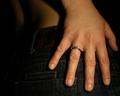
| 04/25/2005 01:57:43 PM |
Simply elegantby PascalComment: Interesting shot. Unfortunatly, we don't really see the item. Its probably Elegant, but the hand is not (no offense to the model). Lighting is a bit harsh for something 'that' elegant as well. A tighter crop would've helped i think. 5 |
| Photographer found comment helpful. |
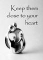
| 04/25/2005 01:56:29 PM |
Keep them close to your heartby dsa157Comment: nice little 'thing". Although i'm not sure what it is, I'd guess its a kind of neckless of some kind. The Item feels dirty unfortunatly (inside) and is slightly out of focus. The Font used is interesting, but for some reason, i don't find it appealing; perharps because it feels as dirty as the item?! 6 |
| Photographer found comment helpful. |
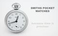
| 04/25/2005 01:54:51 PM |
Smithsby justinbrookComment: Very nice composition. Lighting is simple but efficient. Its nice to see the white background is mastered, with no yellow burns around the shadows. The text is simple and catchy, but suffered because of the image compression (all the curves). Also the second part of the text is kind of odd, as its disapearing, making it harder to read. One suggestion would be to reshoot without hidding the "smiths" on the watch. That's the important part of the watch, which is partially hidden. GW. 8 |
| Photographer found comment helpful. |
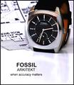
| 04/25/2005 07:08:19 AM |
Arkitektby sbeaumontComment: Very cool idea! I like the text and slogan as well! The watch is in superb focus sharpness. Lighting is very good as well. I like the background detail as well, giving more 'power' to the watch, following the 'Accuracy' theme! Very nice. One thing that bugs me is the Reflection. It drags away the image and breaks the 'accuracy'. 8 |
| Photographer found comment helpful. |
Home -
Challenges -
Community -
League -
Photos -
Cameras -
Lenses -
Learn -
Help -
Terms of Use -
Privacy -
Top ^
DPChallenge, and website content and design, Copyright © 2001-2025 Challenging Technologies, LLC.
All digital photo copyrights belong to the photographers and may not be used without permission.
Current Server Time: 04/07/2025 10:18:52 PM EDT.