| Image |
Comment |
| 01/21/2007 05:10:27 AM |
Such Perfect Graceby strangeghostComment: Wow! What a capture. I am guessing you had to bump ISO pretty high to freeze the hummingbird, hence the noise, which does not detract from the beauty of the photo. Worthy of 10 |
 Photographer found comment helpful. Photographer found comment helpful. |
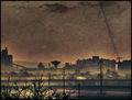
| 01/21/2007 05:08:03 AM |
Prelude to a Stormby howzitComment: Great use of colour, not over staturated, yet keeps that menace of the impending storm. It is a photo that draws the eye back time and again to see if the wispy clouds have moved at all. Well worth 10 |
| Photographer found comment helpful. |
| 12/29/2006 08:44:51 AM |
Waste Landsby GiorgioComment: Harsh Environment. This is grimmer than a really grimy, grim thing. It creates feelings of depression and hopelessness. Well Done, well worthy of a 10. |
| Photographer found comment helpful. |
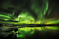
| 12/27/2006 11:53:06 AM |
Celestial by LalliSigComment: This is one of best photos I've seen on DPC! I would have given it 11, but cos you didn't use the full size available, I only gave you 10! |
| Photographer found comment helpful. |
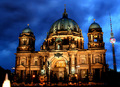
| 06/06/2006 12:19:23 PM |
berlin nighshotby shotComment: Hi from the Critique Club.
Here is your requested critique.
Technical: Well focused and centralized. Effects have been used to increase the effects of the night sky and the building's lights help increase the drama of the photo.
Composition: The main subject, the cathedral is centrally placed with the dramatic sky emphasising the features of the uplit facia of the building. The fountain in the foreground detracts from the image by drawing the eye to the left bottom corner. Although the TV tower is a landmark, it looks out of place and the distortion of lens makes it appear to be toppling towards the cathedral. The lower right corner appears dark and featureless.
Overall: This is stunning picture of a fine building. The use of effects has made for a dramatic image which is close to being over manipulated. The TV tower, although a landmark, and the fountain detract from the main subject. This photo certainly meets the challenge for Architecture, but falls short of displaying just how fine the building is by being too all encompassing. I would love to have seen the main arch at the front shown in the same lighting, but closer. A very good photo that many would be pleased to have taken. The marks it got place it where it should be in the challenge and I hope you go on to take more photos of this subject. Thanks for allowing me to critique this shot. |
| Photographer found comment helpful. |
| 11/13/2005 11:04:44 AM |
I can see better with glassesby edmengComment: Greetings from the Critique Club:
This was your entry in the Transparency II challenge and it fits the brief very well.
Technical:
Good use of maximum size allowed. Good DOF and focusing. None of the processing or sharpening seems overdone, although the arm of the glasses on the left of the photo seems a bit over bright. The centre of focus is the glasses and so is sharper than the child's eyes.
Composition:
A well composed image. The glasses divide the image 50/50 and I don't quite see the connection of the text with the child, unless it is the words highlighted. It is a clever move to include the child's eyes in the one frame of the glasses and it looks like the child is actually looking at you.
Overall:
Not the most original idea but it works. There are some nice touches, the focus is great as is DOF and it is not easy to get a clear shot of a page and through glasses. Nothing has been overdone in the processing stages and your score reflects the opinion of voters. I will watch your future entries. I hope this is helpful and constructive.
Steve |
| Photographer found comment helpful. |
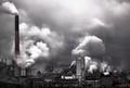
| 11/09/2005 11:05:35 AM |
industrious by ursulaComment: Stunning, atmospheric, grimy and busy! A worthy 3rd...I thought it would get 1st, it deserved to be Number One, and that Sigma lens rocks!
Steve |
| Photographer found comment helpful. |
| 11/09/2005 10:44:44 AM |
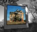
Colour Abandonedby ColeyComment: Greetings from the Critique Club:
Colour Abandoned was your entry in the Transparency II challenge and it is one serious photo.
Technical:
Good use of the maximum permitted size, beautifully focused and good DOF. The desat works superbly and there is no sign of oversharpening, although there appears to be a hint of noise/grain in the frame, however this adds to the overall effect. I could be really picking and start inspecting ever detail, but I won't because the image stands as it is.
Composition:
I like the positioning, it is not quite central in that big square format which makes it feel even more quirky. The reflections in the glass look ghostly and fit the abandoned house very well. My only criticism is that the bottom of the window frame appears to be resting on the ground. I know it isn't, but that is the impression I get, due to the rising ground behind and the long grass. But it doesn't spoil the image in anyway.
Overall:
A stunning image with great imagination. I can't find any faults, other than my brief mention of the hanging bit, and that isn't a fault. Your past images are well scoring and this 7th place is well deserved. A great image for prints. Well Done and I hope this is helpful and constructive.
Steve |
| Photographer found comment helpful. |
| 11/08/2005 11:29:25 AM |
Paper waveby aKiwiComment: Greetings from the Critique Club:
Paper wave was your entry for the Delicate challenge, and I think you made the right choice moving this to Delicate instead of Light On White II.
Technical:
Excellent focusing and DOF. The lighting and cropping is superb. You have made good use of the maximum size allowed. The texture and shading of the paper against the white background works really well. I have just one comment of criticism and it is very minor. I wondered what the image would look like if the crop was not so tight at the top and showed the curve of the paper against the background.
Composition:
Superb! Nothing else I can say other than my last comment in technical about the crop.
Overall:
This would have creamed a Minimalism challenge. Judging by the scores I don't think a lot of voters really understood or took the time to study your image and so it scored far lower than it should have. It matches your other high scores but suffered unfairly during voting. A top 5 image, well done. I hope this brief critique is helpful and constructive. I would normally say more, but why should I? It is a winner in all but votes.
Steve |
| Photographer found comment helpful. |
| 11/08/2005 10:55:42 AM |
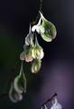
Vine of Laceby lytaComment: Greetings from the Critique Club:
Vine of Lace was your entry in the Delicate challenge and this meets the brief very well.
Technical:
The first thing I noticed when the image appeared was the branch at the bottom right of the image. It is shame this could not be cropped out, but that have meant losing the flowers/seeds at the bottom of the image. Your DOF drops off really quickly, suggesting that the main branch was coming towards your camera. There is noticeable noise/grain on the bottom left, which is unusual for ISO 100, I feel this is probably due to the amount of USM used as the fully in focus flowers/seeds at the top of the image are suffering from slight oversharpening. The lighting is very effective as is the light purple in the bottom right. Good use of portrait format and maximum size. Thanks for putting in your processing steps, makes life a lot easier.
Composition:
Using portrait format and maximum size really brings the image alive. The main subject is central in the shot and some viewers do not like this, but here it worked very well. I think you could have cropped tighter to lose the bottom branch, even at the expense of the lower flowers/seeds.
Overall:
The branch at the bottom is distracting probably cost a few tenths on points, still a good score though lower than some of your others. Just a little oversharpening which has introduced some noise/grain in the lower third of the image. A really good photo that suffered slightly from the already mentioned points. If you have time, try cropping and using less USM to see what the effects are like. Well done. I hope this is helpful and constructive.
Steve |
| Photographer found comment helpful. |
Home -
Challenges -
Community -
League -
Photos -
Cameras -
Lenses -
Learn -
Help -
Terms of Use -
Privacy -
Top ^
DPChallenge, and website content and design, Copyright © 2001-2025 Challenging Technologies, LLC.
All digital photo copyrights belong to the photographers and may not be used without permission.
Current Server Time: 04/08/2025 07:50:54 AM EDT.