| Image |
Comment |
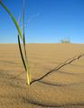
| 05/03/2004 10:35:21 AM |
The Shady Proportions of Time.by boredComment: Wonderful sense of perspective. The texture of the sand is great. I'd love to see the end of the shadow and the grass fully in frame. The sky is great. Message edited by author 2004-05-05 02:21:39. |
 Photographer found comment helpful. Photographer found comment helpful. |
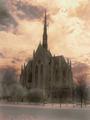
| 05/03/2004 10:33:59 AM |
|
| Photographer found comment helpful. |
| 05/01/2004 10:40:48 AM |
Antennaby GeneralEComment: Originally posted by GeneralE:
I'm a sucker for cloudscapes too, and one reason I went B+W was to put more emphasis on the silhouette aspect rather than make it a nice cloudscape with an antenna in the way. |
Oh yes, now that I see the color ones, B&W was the right way to go for the challenge.
But I must say that I love the simple color "adjusted" one. We just don't get great clouds here in LA like that ... I'd have to go to the high desert for a storm or something. |
| Photographer found comment helpful. |
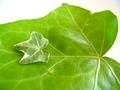
| 04/30/2004 04:54:38 PM |
Small Leaf, Big Leafby SedenComment: Very nicely posed and shot. I'd like the little leaf's focus a bit crisper but I love the softness of the colors and the composition. Good work. |
| Photographer found comment helpful. |
| 04/30/2004 04:53:48 PM |
Real size mirrorby oskarComment: Wonderful colors and exposure for a night shot - the reflections are really engaging. The angles of the buildings doesn't quite bring the composition together for me and the hotness of the street lamp is a little distracting to that end. Very nice shot. |
| Photographer found comment helpful. |
| 04/30/2004 04:51:51 PM |
Straw Hunterby russiComment: I love the colors in this photo and the way they are banded horizontally and then the contrast of the crisp vertical bars of the fence in the foreground. It's a wonderful demonstraton of perspective. |
| Photographer found comment helpful. |
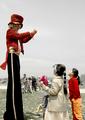
| 04/30/2004 04:08:26 PM |
Circus Clownby JoviComment: I love the subject of this, the colors are wonderful. I'd like to see it anchored though - showing the man on stilts and the two women all the way down to their feet. Nice job. |
| Photographer found comment helpful. |
| 04/30/2004 03:14:59 PM |
Nudeby DrJOnesComment: Greetings from the Critique Club
Composition: Nice composition and posing of the model. I agree with the other comments that say that it should either be centered or slightly more off center to be completely pleasing. I'd also like to see the light picked up on the bicep of her left arm - I think that'd solve the problem with it getting lost in her chin. She'd probably have to cheat the arm out a little bit, which might change the way her breast sits.
Background: I like your choice of white to grey - how the divide is at her body. It helps the overall drama of the shot. I wouldn't mind something with a little more color in it - either starkly cool or exceptionally warm.
Camera Work: (Focus/DOF/Exposure) - the focus is soft and continuous and feels appropriate for the subject.
Post Processing: The color/saturation/contrast is perfect. The fleshtones are brought out well by the color temperature.
The Challenge: There's a bit too much flesh and detail I think for a silhouette, which may be why it didn't win outright (or maybe it was the subject matter).
My Opinion: A wonderfully posed and masterful shot. Personally, I found the pose a little bland and it feels more like a "study" or "sketch" than a finished work. Maybe a little more twist to her back to give the lines more interest. Your ability to shoot flesh and have it feel warm and soft is wonderful (obviously your model deserve some credit there).
Please let me know if these comments are helpful. If you have any other comments or questions please feel free to PM me. |
| Photographer found comment helpful. |
| 04/30/2004 01:47:05 PM |
Sofitelby banmornComment: This is an interesting composition, I like the textures and DOF, the colors help to give it a more organic feel than if it were shiny blue or metallic. It definitely feels like a study in perspective but I don't get any other emotional reaction from it. |
| Photographer found comment helpful. |
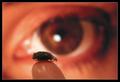
| 04/30/2004 01:41:25 PM |
Gotcha!by KonadorComment: I liked the idea of this photo very much and my comment is rather picky - the fly looks like it's been dead a while and the shininess of the fingertip is a bit distracting - our focus should be on what the subject is looking at - the fly. Nice composition otherwise, could just use a tweak in execution. |
| Photographer found comment helpful. |
Home -
Challenges -
Community -
League -
Photos -
Cameras -
Lenses -
Learn -
Help -
Terms of Use -
Privacy -
Top ^
DPChallenge, and website content and design, Copyright © 2001-2025 Challenging Technologies, LLC.
All digital photo copyrights belong to the photographers and may not be used without permission.
Current Server Time: 04/08/2025 06:16:25 AM EDT.