| Image |
Comment |
| 05/03/2005 02:51:25 PM |
Crystal, stone and lightby rbennyComment: I thought about marbles on concrete as a subject and was happy to see you chose it as a subject. It's a nice marble and the strip of red in it is a great flash of color for this otherwise monotone picture. I'd like to see it a little more saturated. I'm not sure the dark and light helps the composition in this photo. |
 Photographer found comment helpful. Photographer found comment helpful. |
| 05/03/2005 02:49:42 PM |
Cool and Refreshing....by singsunshineComment: A very interesting take on this challenge, I like how the bottle has changed color and shape to play upon our expectations of what a coke bottle should look like. |
| Photographer found comment helpful. |
| 05/03/2005 02:46:43 PM |
So Much in so Littleby joek1dComment: I think you've got the right idea here, the idea of repetition and then the object that's different as the subject. I wanted the iPod to pop a bit more, it's a little small and a little dull looking (did you try it with the screen on?) |
| Photographer found comment helpful. |
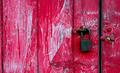
| 05/03/2005 02:45:31 PM |
Wheels within wheels..by manuraoComment: Very nice, simple composition. I like that I can see the red through the holes in the button. The red is a little blown out on the lower left. I'm curious if you experimented with different directions for the weave of the fabric. This is not as pleasing as it could be since it's not really diagonal or vertical. |
| Photographer found comment helpful. |
| 05/03/2005 02:39:54 PM |
|
| Photographer found comment helpful. |
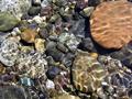
| 05/02/2005 08:36:14 PM |
River Rocksby riversongComment: Greetings from the Critique Club
I like the choice of subject here. I've often spent time looking at the rocks at bottoms of clear streams and rivers. You've found a good subject with the variation in pebble types, colors and sizes.
You've done a good job of capturing the light variations with water without the surface glare. However, the water has caused a bit of crispness to be lost.
The overall composition is lacking, the subject is not clearly defined and the lines of the composition do not flow.
The saturation is good, but the contrast could be bumped up a bit.
Your naturalist treatment of the subject is really captivating, you placed very well in this extremely competetive challenge.
You've already had strong entries so far, I look forward to seeing your work in the future. |
| Photographer found comment helpful. |
| 05/02/2005 06:26:41 PM |
Mysticalby ChinabunComment: Greetings from the Critique Club
The color in this shot is simply stunning. The balance of purple, the pop of yellow in the center and the black background all work exceptionally well together.
Your focus is crisp and the depth of field adds to the overall impact of the photo.
I agree with some of the commenters that your saturation of purple (magenta and/or blue) seems a little heavy, but that could be a stylistic interpretation.
My main critical comment is about the composition. The lowest petal is too close to the bottom of the frame, it needs a little more breathing room there and the shot could probably be cropped a little on the left side, especially to get rid of the distracting green in the background.
I am partial to flower macros and find this one to be quite stunning, good work. |
| Photographer found comment helpful. |
| 05/02/2005 02:09:22 PM |
Mysticalby ChinabunComment: oops, double post (sorry) Message edited by author 2005-05-02 22:26:32. |
| Photographer found comment helpful. |
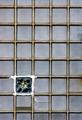
| 05/02/2005 08:21:54 AM |
1 / 35by virtuamikeComment: I really like this one - the statement of repetition and then a different element is definitely minimalist. Did you explore different ratio formats? Just a thought that maybe a perfect square to echo the squares of the glass blocks might lend more to the minimalist vibe. 7 |
| Photographer found comment helpful. |
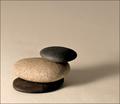
| 04/29/2005 01:25:37 PM |
Three Stonesby TampaDanComment: The simplicity of the three stones is really nice. I'm not keen on the background, I'm not sure if it's because I'd prefer it to be high key or more textured/colored. I like how you chose three different kinds of rocks. |
| Photographer found comment helpful. |
Home -
Challenges -
Community -
League -
Photos -
Cameras -
Lenses -
Learn -
Help -
Terms of Use -
Privacy -
Top ^
DPChallenge, and website content and design, Copyright © 2001-2025 Challenging Technologies, LLC.
All digital photo copyrights belong to the photographers and may not be used without permission.
Current Server Time: 04/07/2025 10:18:28 PM EDT.