| Image |
Comment |
| 02/12/2004 08:29:43 AM |
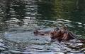
Taking a Breathby dr rickComment: -from the critique club-
interesting shot, and nice framing. This is a good human interes shot, and is enjoyable, but perhaps doesn't fill me with a mood. Maybe i want more setting, perhaps this shot would be more intersting with a wide expanse of water, with the little hippo head sticking out. just a thought. I think perhaps right now i have a problem with the cropping. it is cropped JUST on the edge of the water large water ripple. This makes for a tense uneasy image. It is a decent image but i just can't figure out why it doesn't have impact for me. Maybe there isn't enough variety in colors.. everything is a dull green... you could try playing with saturation, but i am not sure it would help... i am not sure what more to say. Good us of rule of thirds in any case. |
 Photographer found comment helpful. Photographer found comment helpful. |
| 02/07/2004 06:31:08 AM |
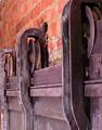
Brick and Oreby puyaComment: I had this image lower and i have been bumping it up a few socres. I really like the lines, flow and simplicity of this. Perhas it is cropped a bit too tight on the left creating tension... either more or less but not RIGHT ON the edge... Good exposure. Well actually.. i am not sure i see any REAL blacks... they seem just ALMOST black to me... in addition to the bricks looking like they could have a little more depth (being a little darker would do this).. but i reall liked it... great image... almost perfect. |
| Photographer found comment helpful. |
| 02/06/2004 01:57:56 PM |
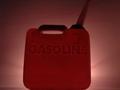
::RED HOT::by DsealeComment: The gas can seems out of focus which is distracting to me. The tip of the can is also 'just' cut off which creates a bit of dificulty for me. My eye starts at the can, then goes to the spout.. and leaves the picture... it doens't make me want to look at the picture. Interesting lighting (from behind) which creates an interesting glow,.. perhaps the can also looks very heavyand too grouded being cropped RIGHT on the bottom of the image. Either heigher up or lower down.. but not RIGHT on the bottom. |
| Photographer found comment helpful. |
| 02/06/2004 01:55:53 PM |
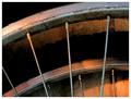
Time to retireby geewhyComment: great colors and interest. I like the dirt on the wall and the wheel's and the warm lighting. A great simple piece, with enough given to let us know what it is and finish the picture with our heads. good job. |
| Photographer found comment helpful. |
| 02/06/2004 01:49:20 PM |
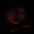
A Square Jawby GeneralEComment: I like the tone and mood of this image. It makes me think and wonder. It is a very dark image, and i know it is meant to be... perhaps i would say it was well exposed, i guess you don't have a bright light source.. and it looks like on the boy's chin the red is almost blasting out,... so perhaps it is fine... I think the cropping of the image was done well.
Perhaps The picture is too contrasty. Perhaps somelight should be given to the entire image... and let it still be dark, but not SO dark. an image can be low key with good detail. This makes an image more interesting generally than an image that is too dark to see anything.
overall, good, just play with the lighting a bit more.
-from the critique club-
and remember, these are just my thoughts. |
| Photographer found comment helpful. |
| 02/06/2004 01:45:00 PM |
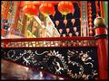
Enter The Dragonby ImagineerComment: This is a very busy photogrpah with lots going on and lots of colors to catch my attention. i think it helps very much and works well with the repetition found in the image. the three large orange lanters, the lanters in the background, the cut out's on the railing. I think all of these are important. The image seems a little washed out in the brigh whites, on the building in the back and on the speakers... and the blacks don't seem quite black. perhaps it is 1/2 stop too light. I think the two speakers on the right are a bit distracting. They are a very odd shape (compared to the rest of the picture) and odd color, and if it were me i would crop them out. Interesting colors, and a very active shot.
hope this helped, and remember it is only my opinion.
- from the critique club - |
| Photographer found comment helpful. |
| 02/04/2004 08:07:34 PM |
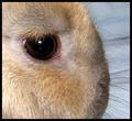
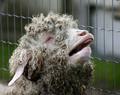
Just My Rabbit ,Characteristic: Very Nice,Forbearingby MonaComment: hei from the critique club
the image is very sharp and has a good tonal range with good darks, lights and middle tones. The white is on the verge of dissapearing but is still hanging in there. On the background to the right there are some lines i find distracting. Perhaps if you used a smooth background you could get rid of this. The placement of the eye was well executed, and is in an attractive spot, perhaps this picture suffers from poor lighting.. perhaps that is being a bit hypocritical to what i said before about tones... but there seems to be a main light source from the left which is blowing out the hair on the left, making a glare in the eye, and making akwardly lit subject. Perhaps if you used a difused light source on the other side, or repositioned your light source that would help. The image is almost abstract in nature, which could work effectivly, but something still seems to be missing. I am not sure what. perhaps play with including more of the rabit, or closer or different lighting. hope some of these sudjestions helped...
and remember.. it is only my opinion |
| Photographer found comment helpful. |
| 02/03/2004 08:39:31 PM |
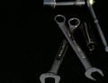
Garage Essentialsby PDavisComment: I feel the cropping in this image is too tight. space around the tools would be effective, or perhaps the opposite, more extreme cropping, but just snipping cropping is rarely effective. Perhaps a little dark. The image also seems very weighted to the right side. There isnothing leading or contrasting the empty space on the left. If even one wrench was stretching over there a bit more it would help. |
| Photographer found comment helpful. |
| 02/03/2004 07:09:13 PM |
" I don't have a garage"by ellamayComment: welllll.............. garage..................... i got a BAD rating on my last challenge for not following the directions close enough..... but... well.... i laughed outloud... this was a great funny image. perhaps you could crop a little of the right. saturation, color, and contrast look good.... funny funny.... i'll give you a 9 .. |
| Photographer found comment helpful. |
| 02/03/2004 04:48:26 PM |
|
| Photographer found comment helpful. |
Home -
Challenges -
Community -
League -
Photos -
Cameras -
Lenses -
Learn -
Help -
Terms of Use -
Privacy -
Top ^
DPChallenge, and website content and design, Copyright © 2001-2025 Challenging Technologies, LLC.
All digital photo copyrights belong to the photographers and may not be used without permission.
Current Server Time: 04/07/2025 10:06:05 PM EDT.