| Image |
Comment |
| 02/24/2004 07:05:33 AM |
|
 Photographer found comment helpful. Photographer found comment helpful. |
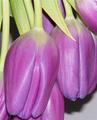
| 02/24/2004 07:04:31 AM |
Tulipsby bjallenComment: nice layout, bottom seems to be a little tightly cropped, good purple color, perhaps a black background would have been good. |
| Photographer found comment helpful. |
| 02/19/2004 07:59:06 AM |
claireby MadMordegonComment: well great promise for this image, but still a few things that bother me. I don't really like how burnt out the image is. i see that you modified the levels to achieve this, but still i think you could have it bright and not burnt out. The cropping seems awfully close to her chin as well. Too close... perhaps if you moved the crop up a distance.. put the eyes on the 1st third.
just some thoughts. |
| Photographer found comment helpful. |
| 02/15/2004 07:47:39 PM |
Rechargeby AV8RComment: this image seems over exposed. (not details in the light.. because it is too light). The sky has no detail, and the sand has lost it's color as well. |
| Photographer found comment helpful. |
| 02/15/2004 07:45:32 PM |
Great Miami River- Hamiltonby Crafty SueComment: this image has too much contrast. If you look in the river and sky, there is no detail, only white and white. The tree's on the right are only black. I am not sure if you adjusted the constrast after you shot this, or if it was just a VERY sunny day, which creates a very contrasting picture. Or perhaps the picture was overexposed (too light) to start with (from the river, the camera may have measured wrong) and you tried to darken it. The whites stayed white, and the tree's just got black. |
| Photographer found comment helpful. |
| 02/15/2004 07:28:10 PM |
Oops. Nearly forgot again.by johnmComment: this image seems slighty overexposed. humorous though. perhaps i would have cropped it a bit differently, leaving more space on the right and top. |
| Photographer found comment helpful. |
| 02/15/2004 07:18:03 PM |
Peek a booby ShelleyComment: fairly interesting, and great idea (there are a couple of shots like this which are really strong).. i think this picture lacks some actual black tone. Or perhaps the sweater on the right, is too flat and close to middle grey. It may work better if it was true black, or darker at least. |
| Photographer found comment helpful. |
| 02/15/2004 07:15:08 PM |
Mysteriousby crabappl3Comment: very interesting image. and great saturation in the eyes. however i am quite diasspointed when looking at this and the 'black' fan things have no black in them. It seems as though they are lightened or are over exposed. The eyes are great though. |
| Photographer found comment helpful. |
| 02/15/2004 07:12:55 PM |
Blackjackby rickhd13Comment: yeah, cleverly done... i think the ace adds interest, and also cleverly covers up the colors on the jack. nice job. |
| Photographer found comment helpful. |
| 02/12/2004 08:32:54 AM |
Snow and Iceby DrakeComment: from the critique club.
I really liket this shot. I forget what i gave it in the challenge but i remember it was a high mark. I really like the lines on the steal thing on the left. The ripples in the ice are very interesting and have a soothing smooth texture. Theh simplicity of the right side of the image is also pleasing, with the snow and sky, and the very sharp line betwen the two. color saturation looks really good, as does the light balance. The now on the middle right DOES look burnt out. I am not sure what you could do to fix this, as it was probably a very conrasty shot (as sunlight shots usually are)... or perhaps contrasty isn't the word, but it has MANY light levels, whereas the camera only records 5 (more or less).. but overall very nice image. Good job. |
| Photographer found comment helpful. |
Home -
Challenges -
Community -
League -
Photos -
Cameras -
Lenses -
Learn -
Help -
Terms of Use -
Privacy -
Top ^
DPChallenge, and website content and design, Copyright © 2001-2025 Challenging Technologies, LLC.
All digital photo copyrights belong to the photographers and may not be used without permission.
Current Server Time: 04/07/2025 09:54:47 PM EDT.