| Image |
Comment |
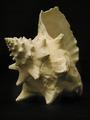
| 02/24/2004 02:56:29 PM |
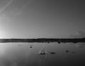
Sea Shellby carrieannComment: fine, doesn't really interest me at all. fairly neurtal lighting... good technically just doesn't draw me in. |
 Photographer found comment helpful. Photographer found comment helpful. |
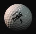
| 02/24/2004 02:55:56 PM |
Pitchers and Catchers Reportby tfaustComment: nice colors (or lack there of)... nice detail on the ball and nice lighting. this seems like an image that could be done really bad or really good. you did it really good. good job. |
| Photographer found comment helpful. |
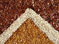
| 02/24/2004 02:55:16 PM |
Flax Pyramidby sgsprayComment: interesting shapes and design. great color and saturation. i likeit quite a bit. it doesn't hold my interest like some images, but it is interesting in as an abstract design. |
| Photographer found comment helpful. |
| 02/24/2004 02:53:46 PM |
Dusterby bledfordComment: interesting image and nice detail and DOF. good colors and shades. decent. |
| Photographer found comment helpful. |
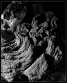
| 02/24/2004 02:53:23 PM |
Driftwoodby mbardeenComment: interesting shapes and textures. i likethe shades of grey. the border works well i think. good image. |
| Photographer found comment helpful. |
| 02/24/2004 02:52:52 PM |
Golf Planetby frodobagginsComment: this image doesn't really hold my interest. it just seems like a golf ball... reasonable tones. |
| Photographer found comment helpful. |
| 02/24/2004 02:51:47 PM |
Harmonyby RoosterComment: this image seems a little dark. i realize it is supposed to be very low key, but there should be detail in the darks. |
| Photographer found comment helpful. |
| 02/24/2004 02:50:59 PM |
Unexpected interruptionby litboltiComment: a nice image.. and interesting composition. the bright lighton the right seems a bit distracting, but perhaps it would be boring withoutit... |
| Photographer found comment helpful. |
| 02/24/2004 07:24:53 AM |
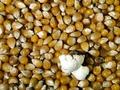
First One Out!by drydocComment: funny image, interesting... perhaps it seems lowsaturation. i know what color popcorn kernals are and these are not the right color... ... it seems like it is a bit grainy, like this was shot ina low light situation... but good idea.. and decent. |
| Photographer found comment helpful. |
| 02/24/2004 07:23:36 AM |
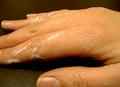
Painting for a Livingby LeniceComment: nice detail and good color. It seems well exposed, and i like.. :) yes like the repetition of the texturein the 'leather' and the hands, how they mirror each other. The cropping is my only complaint perhaps.... as you know... |
| Photographer found comment helpful. |
Home -
Challenges -
Community -
League -
Photos -
Cameras -
Lenses -
Learn -
Help -
Terms of Use -
Privacy -
Top ^
DPChallenge, and website content and design, Copyright © 2001-2025 Challenging Technologies, LLC.
All digital photo copyrights belong to the photographers and may not be used without permission.
Current Server Time: 04/07/2025 09:55:43 PM EDT.