| Author | Thread |
Comments Made During the Challenge  |
|
|
02/24/2004 02:51:47 PM |
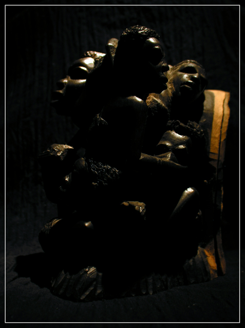
| this image seems a little dark. i realize it is supposed to be very low key, but there should be detail in the darks. |
|
 Photographer found comment helpful. Photographer found comment helpful. |
|
|
02/24/2004 02:50:27 AM |
I like the idea, but it is a bit to dark for my taste.
Harm |
|
| Photographer found comment helpful. |
|
|
02/23/2004 05:01:17 PM |
| being too dark leaves me wondering what this looks like, it may be interesting |
|
| Photographer found comment helpful. |
|
|
02/23/2004 03:19:26 AM |
| a bit too dark to see anything on my screen. |
|
| Photographer found comment helpful. |
|
|
02/22/2004 09:17:12 AM |
| Maybe a little TOO dark... |
|
| Photographer found comment helpful. |
|
|
02/22/2004 04:31:01 AM |
| A lttle too dark for me. I originally scored you way down but it has grown on me and the lightis the problem. |
|
| Photographer found comment helpful. |
|
|
02/21/2004 07:34:17 PM |
| Mysterious...but lacking in texture IMHO. |
|
| Photographer found comment helpful. |
|
|
02/21/2004 02:25:29 AM |
| I guess I don't say this often: but I think this shot is a tad too dark for my liking. |
|
| Photographer found comment helpful. |
|
|
02/20/2004 09:21:09 PM |
| This is simply too dark. Textures are undefined/hidden in shadows. A better exposure might have revealed more. |
|
| Photographer found comment helpful. |
|
|
02/20/2004 06:30:02 PM |
|
| Photographer found comment helpful. |
|
|
02/20/2004 07:17:45 AM |
| Very cool subject matter has real potential. Photo could use some light bounced in from shadow side to open up some detail in otherwise pitch black shadows. Rim lighting would help separate subject from background as well. Frame/compose in closer for greater impact and to leave out distracting vertical tan piece on righ-hand side. Keept it up! :) |
|
| Photographer found comment helpful. |
|
|
02/20/2004 06:20:50 AM |
| This picture is too dark to make out what the subject is. It wouldn't take much lightening to make it a much better photo. |
|
| Photographer found comment helpful. |
|
|
02/19/2004 08:00:08 AM |
| I've looked on two different monitors, and the picture is much too dark on both of them, so it's hard to vote on this. |
|
| Photographer found comment helpful. |
|
|
02/19/2004 07:50:06 AM |
| Picture is too dark for me. I would want to see the texture of the sculpture brought out more. |
|
| Photographer found comment helpful. |
|
|
02/19/2004 06:17:14 AM |
| Having trouble seeing any detail in this. I hate the plethora of comments about thing being too dark sometimes, but I've looked at this under a number of different brighness settings and can't really get much visible. Those few reflections give quite a strong sense of texture though - of harness, of being cut from stone. |
|
| Photographer found comment helpful. |
|
|
02/19/2004 05:04:13 AM |
| Unfortunately, this is a little dark which I think tends to make it lose some of it's textures. It is an interesting subject that I think just a little more light would've helped. |
|
| Photographer found comment helpful. |
|
|
02/19/2004 02:17:03 AM |
| Too dark, but the reflection on the top head are great. If you could have gotten that on the other figures this would have been neat. |
|
| Photographer found comment helpful. |
|
|
02/19/2004 01:25:13 AM |
| Too dark. On my monitor I find it very hard to see. |
|
| Photographer found comment helpful. |
|
|
02/18/2004 07:02:40 PM |
| Overall, this seems a bit dark |
|
| Photographer found comment helpful. |
|
|
02/18/2004 05:54:46 PM |
| I really can't see the subject, so I think it's too dark. |
|
| Photographer found comment helpful. |
|
|
02/18/2004 05:41:06 PM |
| More light would help. Interesting subject. |
|
|
|
02/18/2004 05:17:05 PM |
| nice idea I but hard to see. |
|
| Photographer found comment helpful. |
|
|
02/18/2004 04:50:18 PM |
| The yellowish area of the doorway in the background is distracting. |
|
| Photographer found comment helpful. |
|
|
02/18/2004 01:05:43 PM |
| I am going to assume it is my monitor (though I can see the bars at the bottom), but it is a touch too dark I think. while this lends to a dramatic effect, it leaves the viewer lacking if they are looking for texture. |
|
| Photographer found comment helpful. |
|
|
02/18/2004 05:28:14 AM |
|
| Photographer found comment helpful. |
|
|
02/18/2004 02:58:13 AM |
| Nice subject but a bit too dark. |
|
| Photographer found comment helpful. |
|
|
02/17/2004 08:43:07 PM |
| way way way too dark - i have no clue what i am looking at |
|
| Photographer found comment helpful. |
|
|
02/17/2004 08:23:26 PM |
| Seems like an interesting sculpture, but too dark. |
|
| Photographer found comment helpful. |
Home -
Challenges -
Community -
League -
Photos -
Cameras -
Lenses -
Learn -
Help -
Terms of Use -
Privacy -
Top ^
DPChallenge, and website content and design, Copyright © 2001-2025 Challenging Technologies, LLC.
All digital photo copyrights belong to the photographers and may not be used without permission.
Current Server Time: 04/07/2025 02:21:02 PM EDT.