| Image |
Comment |
| 10/21/2005 01:14:00 AM |
Rover Netby banmornComment: these arent reflections...nice image though
4 for beautiful photo not meeting challenge, would be a 6 or 7 |
 Photographer found comment helpful. Photographer found comment helpful. |
| 10/21/2005 01:04:01 AM |
take time to reflectby mandyturnerComment: i think i already commented and voted on this, but doesnt look like the vote went thru properly so...i'll try n remember what my comment was, lol
really nice tones captured, good uncluttered composition but i'm not convinced about the centred comp. it did take me a little while initially to work out what i was looking at. i think it would be better with more negative space above, so the main subject sits along the bottom third line |
| Photographer found comment helpful. |
| 10/21/2005 01:01:36 AM |
Corporateby ChiquiComment: i like the slanting lines of windows, and the juxtaposition of the round building and square building |
| Photographer found comment helpful. |
| 10/21/2005 01:00:06 AM |
Reflections of Natureby awrightlpcComment: beautiful scene, reflections captureed well. composition works fine, and is aided (imo) by the foreground bushes. Lighting could be better |
| Photographer found comment helpful. |
| 10/21/2005 12:58:56 AM |
Lighthouse Reflectionsby lisajamesComment: i want to see this w/out the slanting of the window frame, but i understand that would be hard w/out your reflection in the image. but because of the slant, the horizon is wonky. I like the reflection captured, i just wish the sky was a little more dramatic. |
| Photographer found comment helpful. |
| 10/21/2005 12:56:34 AM |
firetruck vanityby DonaldComment: she seems to be pulling a face, which spoils the photo somewhat. lighting is quite flat, imho. composition is good, but because of the lighting colours are dull. |
| Photographer found comment helpful. |
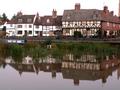
| 10/21/2005 12:54:47 AM |
Reflections on Past Timesby mexicoComment: nice idea, but i'm not sure of the almost centred composition - not very dynamic, makes the photo a little stagnant. i would try cropping much lower at the top, so the riverboat becomes a more integral part of the image, and the composition becomes more interesting. Try this again on a sunnier day, because the lighting is very flat |
| Photographer found comment helpful. |
| 10/21/2005 12:49:27 AM |
Reflections of Kenadayby KivetComment: i think the low DOF has worked effectively here, but the foreground (reeds) is a bit dull and not 100% sharp. However, the composition is spot on and fits the challenge fine. |
| Photographer found comment helpful. |
| 10/21/2005 12:44:32 AM |
scaffoldingby YevgenytheredComment: i think the reflection is just the top right corner bit, in which case it doesn't really seem to enhance the photo at all, and is just there to give a link to the challenge. Having said that, the rest of the photo is really nice. i like theabstract shapes and patterns on the ground, and the B+w works really well to bring out the tones. the two diagonals brring the composition together effectively |
| Photographer found comment helpful. |
| 10/20/2005 11:58:27 PM |
Bridge to Nowhereby greslizzzComment: the tall format is interesting, but i personally would prefer it slightly squatter. the composition is good, drawing your eye to the bridge and mist behind, but i don't like the green hue, espesially round the trees. The foreground river is a good leading line, but could be cropped a little higher |
| Photographer found comment helpful. |
Home -
Challenges -
Community -
League -
Photos -
Cameras -
Lenses -
Learn -
Help -
Terms of Use -
Privacy -
Top ^
DPChallenge, and website content and design, Copyright © 2001-2025 Challenging Technologies, LLC.
All digital photo copyrights belong to the photographers and may not be used without permission.
Current Server Time: 04/07/2025 10:12:26 PM EDT.