| Image |
Comment |
| 11/06/2005 08:37:21 PM |
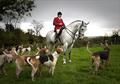
Dead End ... for a foxby FalcComment: The border between the sky and the rest of the image is too sharp - try feathering your edges when you mask the sky. Since this was an advanced editing challenge, burning the sky to give it more depth would have been allowed. The DoF seems to be centered on the dogs; I think that the image would have been stronger if the focal point was the figure on the horse.
|
 Photographer found comment helpful. Photographer found comment helpful. |
| 11/06/2005 08:31:22 PM |
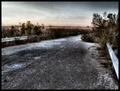
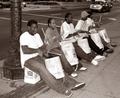
End of the Roadby gurlwithapenComment: I like this image, but I would prefer to have a clear focal point (a bent license plate, discarded shoe, tire tracks, etc.). Adding noise was a good idea, but it looks like you compressed it too much. Since you're still well under the 250K limit you would have been better off submitting a larger file with the noise intact.
|
| Photographer found comment helpful. |
| 11/06/2005 08:27:28 PM |
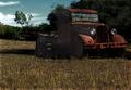
Out to Pastureby JutildaComment: The image is nice, but you used way too much USM when sharpening this image. The colors on the near side of the truck also look odd. Did you pull all of that detail out of a nearly black shadow? Burning the sky a bit would have reinforced the moody feel of this image.
|
| Photographer found comment helpful. |
| 11/06/2005 08:24:46 PM |
Sarah Badgerby 77LTDComment: The idea is solid, but the colors are rather washed-out and the lighting seems too flat. Altering the saturation and contrast would have made this image significantly more interesting.
|
| Photographer found comment helpful. |
| 11/06/2005 08:22:35 PM |
At the Dead Endby stare_at_the_sunComment: This is an interesting shot, but your ghost stayed in the frame too long; aside from his legs he looks too solid.
|
| Photographer found comment helpful. |
| 11/06/2005 08:20:35 PM |
|
| Photographer found comment helpful. |
| 11/06/2005 08:19:20 PM |
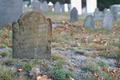
Journey's Endby KOKOCATComment: The intended message is clear, but the composition isn't particularly interesting and the focus is rather soft.
|
| Photographer found comment helpful. |
| 11/06/2005 08:17:42 PM |
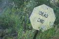
abusedby melodeeComment: The low saturation on the sign contrasts too strongly with the relatively lush looking vegetation. Since this was an advanced editing challenge you might have tried masking the sign, inverting the selection and burning the background, then hue shifting the color of the sign toward a rusty red.
|
| Photographer found comment helpful. |
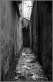
| 11/06/2005 08:15:06 PM |
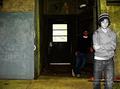
Untitledby TiberiusComment: This image lacks any clear subject. If the door at the end of the alley is the intended foal point using a shallower DoF would have helped to direct the viewer's attention there. |
| Photographer found comment helpful. |
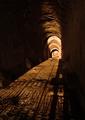
| 11/06/2005 08:13:29 PM |
Imprisonedby wetlandComment: As long as you could keep it recognizable I think that having the shadow of a person in a fetal position against the bars or at the end of the tunnel would have added an extra punch to this strong image.
|
| Photographer found comment helpful. |
Home -
Challenges -
Community -
League -
Photos -
Cameras -
Lenses -
Learn -
Help -
Terms of Use -
Privacy -
Top ^
DPChallenge, and website content and design, Copyright © 2001-2025 Challenging Technologies, LLC.
All digital photo copyrights belong to the photographers and may not be used without permission.
Current Server Time: 04/08/2025 07:47:24 AM EDT.