| Image |
Comment |
| 04/18/2005 08:23:30 AM |
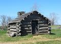
Valley Forgeby gedisaComment by nsmith: I don't know if this is abandoned or not, but I did not rate you down for that. Your composition could be improved by shifting the cabin to the left or right, or try to get the horizon from dead center. The shadows help the detail, perhaps they could have been a little longer, i.e. later in the day. |
 Photographer found comment helpful. Photographer found comment helpful. |
| 04/17/2005 10:30:18 PM |
Valley Forgeby gedisaComment by Brad: Good subject, but a bit "static" with the image being so center.
Perhaps a lower angle, a shift left/right would help.
Unsure on your software, but in PS, shifting the hue of the yellow slightly over to the right, bring it's saturation up a little and bringing the lightness down on it would give the grass a deeper, richer look. |
| Photographer found comment helpful. |
| 01/18/2005 08:39:29 AM |
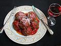
Meatballsby gedisaComment by engteach: A nice, clean picture which would make a good food advertisement. I like thecomposition but I don't think both utensils were neededand the fork leaving the image is a small problem for me.Nice use of colors. |
| Photographer found comment helpful. |
| 01/11/2005 09:27:00 PM |
Meatballsby gedisaComment by taterbug: Nice idea. Creative and humorous. I don't like how the fork and glass are cut off in the framing of the pic. |
| Photographer found comment helpful. |
| 12/19/2004 05:37:43 AM |
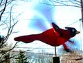
Up, Up and Awayby gedisaComment by sailracer_98: This image looks like it had a heavy editing hand- like the contrast and birghtness were cranked up too much. I think this shot could be greatly improved by shooting with a different background. The blown out sky and multiple telephone lines cris-crossing the image greatly detract from the photo. A more shallow depth of field might also help, but you might not be able to achieve it and still get the motion blur in the wings (depending on your equipment). Using your flash for some fill lighting might help expose the bird properly without making the sky as overexposed. These are just some techniques that in my opinion might help improve this image. |
| Photographer found comment helpful. |
| 12/17/2004 10:56:22 PM |
Up, Up and Awayby gedisaComment by Ambo: I would like to have seen the sky with more colour...very washed out/burnt. But you have really gotten the concept of wind across with this shot. |
| Photographer found comment helpful. |
| 12/15/2004 07:12:35 AM |
|
| Photographer found comment helpful. |
| 12/07/2004 06:16:37 AM |
Carolersby gedisaComment by dipaulk: This was a cute idea for the challenge. I think it might be improved with some diffused lighting -- the flash appears to have created harsh shadows in the background and blown-out shine on the faces. I might also suggest getting parallel with the characters instead of looking down on them. And finally, I'd crop it a little closer. Hope this is helpful :) |
| Photographer found comment helpful. |
| 12/01/2004 02:16:57 AM |
Carolersby gedisaComment by Travis99: Great concept for the Holidays, I don't see anything special, the b/g goes nice w/ the subject, the lighting on the faces seem a bit harsh, maybe try to soften the light up and it could inprove |
| Photographer found comment helpful. |
| 11/24/2004 03:43:54 PM |
I'm the boss here!by gedisaComment by AutumnCat: Looks like the cat is actually listening. This looks like a snap shot. Maybe a closer crop or different angle to give it more interest. |
| Photographer found comment helpful. |
Home -
Challenges -
Community -
League -
Photos -
Cameras -
Lenses -
Learn -
Help -
Terms of Use -
Privacy -
Top ^
DPChallenge, and website content and design, Copyright © 2001-2025 Challenging Technologies, LLC.
All digital photo copyrights belong to the photographers and may not be used without permission.
Current Server Time: 04/09/2025 11:58:12 AM EDT.