| Image |
Comment |
| 02/05/2005 11:54:20 AM |
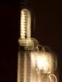
Empire State Lightby suecunningComment by David.C: The points that I am sure you have heard already in the comments; image size is not using the allowed size of 640 pixels on a side and has a bit of a clockwise tilt. The motion blur is so obvious I will assume it was intentional, and it certainly brings the focus of the image away from the building (as a building) and places it squarely on the lights. A great way to meet the challenge topic head on. However, abstracting the building in this way leaves you with composition only to produce an effect -- and it is a bit heavy on the right hand side. The large bright area in the lower right out weights the rest of the image -- I believe placing more negative space on the right and less on the left would have produced a better composed image. |
 Photographer found comment helpful. Photographer found comment helpful. |
| 02/05/2005 07:12:43 AM |
|
| Photographer found comment helpful. |
| 02/03/2005 09:58:01 AM |
|
| Photographer found comment helpful. |
| 02/02/2005 01:21:02 AM |
Empire State Lightby suecunningComment by Node: Sorry the photo is very small and blured with funny squiggly things. I would suggest you look in the tutorial section for re sizing photos for a challenge. |
| Photographer found comment helpful. |
| 02/01/2005 10:41:27 AM |
|
| Photographer found comment helpful. |
| 01/30/2005 10:09:14 PM |
Empire State Lightby suecunningComment by shavenwalrus: Oh dear, this is WAY too small and will get marked down severely for that reason.
The photo itself is puzzling. What is it? It just looks like a blur. |
| Photographer found comment helpful. |
Home -
Challenges -
Community -
League -
Photos -
Cameras -
Lenses -
Learn -
Help -
Terms of Use -
Privacy -
Top ^
DPChallenge, and website content and design, Copyright © 2001-2025 Challenging Technologies, LLC.
All digital photo copyrights belong to the photographers and may not be used without permission.
Current Server Time: 04/08/2025 03:00:00 AM EDT.