| Author | Thread |
|
|
09/01/2004 10:33:06 AM |
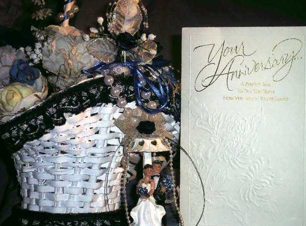
| You seem to have the same problem I do. Take a picture with alot of detail then when you resize it you lose the detail and it looks either out of focus or "too sharp". I have the same camera and am just starting to notice things like that. To attempt to compensate, though not much, I try to get my "picture" a bit smaller in the frame then crop out the extra. This makes the picture smaller and I get less distortion when I change the file size for the web. I liked this picture and gave it an 8. Just kind of thought the cream color of the card clashed with the white of the basket and bride. |
|
Comments Made During the Challenge  |
|
|
08/26/2004 02:58:13 PM |
| Good idea for subject. I see a little distortion around the wording. Did you save it as a tif image before editing in software? Working on a jpg image will sometimes cause that because they compress the data. Just a thought...for whatever it's worth... |
|
|
|
08/26/2004 09:51:50 AM |
| The sentiment is nice and loosely ties to the theme. This is a pretty difficult shot to attempt. The dark and detailed subject on the right and the light and low contrast subject on the left make exposure, contrast and balance veryy difficult. Colors seem okay. However it feels unbalanced to me. It feels pretty busy and may be a bit over sharpened. |
|
|
|
08/25/2004 09:29:41 AM |
| A little too bright on the card - could have made the writing clearer. Also seems to be a little off in composition. |
|
Home -
Challenges -
Community -
League -
Photos -
Cameras -
Lenses -
Learn -
Help -
Terms of Use -
Privacy -
Top ^
DPChallenge, and website content and design, Copyright © 2001-2025 Challenging Technologies, LLC.
All digital photo copyrights belong to the photographers and may not be used without permission.
Current Server Time: 04/08/2025 01:33:10 AM EDT.