| Author | Thread |
|
|
09/07/2004 07:09:23 PM |
Technically - acceptable. The scene is quite dull though. Mark =6.
Message edited by HBunch - Critique Club status removed. |
|
|
|
09/03/2004 10:52:07 AM |
Originally posted by Rooster:
Originally posted by svahdat:
Get a life |
too bad this guy didnt have anything constructive to say...
I feared this would not do so well despite fitting the challenge better than most, IMO.
Technically it's a nice shot... too bad folks can see past there own crap.
Takes guts to do this. Big Ups for it! |
I completely agree. I scored you an 8. Good job. |
|
|
|
08/31/2004 08:05:42 PM |
Originally posted by svahdat:
Get a life |
too bad this guy didnt have anything constructive to say...
I feared this would not do so well despite fitting the challenge better than most, IMO.
Technically it's a nice shot... too bad folks can see past there own crap.
Takes guts to do this. Big Ups for it! |
|
Comments Made During the Challenge  |
|
|
08/31/2004 07:21:59 PM |
Sorry.
Your image may be good to the masses today, but I tend to think the opposite, and my opinion counts.
4 from me. |
|
|
|
08/31/2004 06:41:18 PM |
|
|
|
08/30/2004 01:26:18 PM |
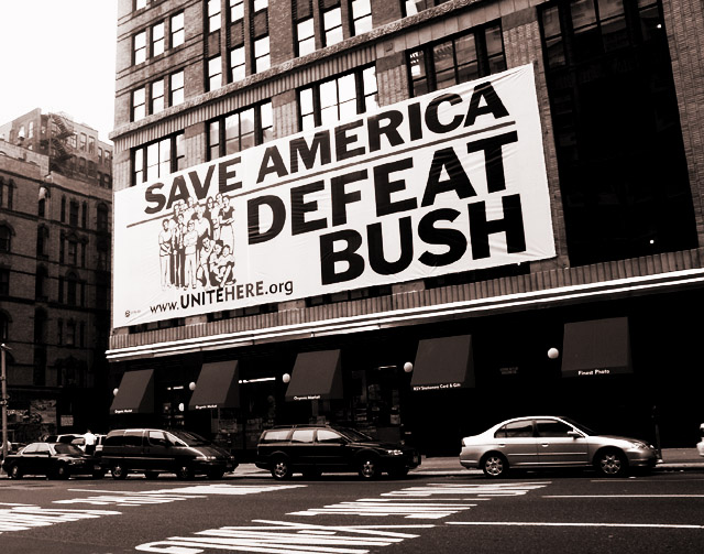
| Effective! Nice journalistic style. |
|
|
|
08/30/2004 08:33:31 AM |
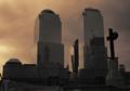
| I like the high contrast sepia here. Not sure the subject and the image it self is very interesting visually (although the message is). |
|
|
|
08/29/2004 02:39:29 PM |
| Print is very well done. Nice blacks, strong whites and a good tonal range. Yoiu are probably tossing out half of the voters reactions by picking such a controversial subject. |
|
|
|
08/29/2004 12:39:46 PM |
|
|
|
08/29/2004 06:13:00 AM |
| Your right.... big hope. :) |
|
|
|
08/28/2004 07:56:16 PM |
| I like this photo, it's well taken and it conveys the theme well. I like the duotone in it and the framing. |
|
|
|
08/28/2004 06:14:58 AM |
|
|
|
08/27/2004 11:33:44 PM |
| I was thinking along the same lines but I thought it would be too political. That said, I hope! |
|
|
|
08/27/2004 07:10:53 PM |
| Wow, that poster looks like one of the old communist propoganda posters from the 60's! You framed it up nicely, the tones are nice. Scary concept....think HItler, Mussolini, Kerry.... |
|
|
|
08/27/2004 07:25:15 AM |
| I love the colors and composition. |
|
|
|
08/26/2004 03:02:53 PM |
| Haha! This is perfect. Exactly what we all should be hoping for! |
|
|
|
08/26/2004 06:40:15 AM |
| Ummmm. . . sorry. . .this does not depict hope -- it depicts a nightmare :) |
|
|
|
08/25/2004 03:40:19 PM |
| Don't agree with the message, but it reflects a certain sentiment pretty well. My eye is drawn to the sky in the upper left, which is highly exposed. I understand that it would have been difficult to capture, but the same scene without the vehicles below would be an improvement in my opinion. Overall, good effort though. 6 |
|
|
|
08/25/2004 03:30:03 PM |
| Great idea...I almost did something similar...automatic 10! |
|
|
|
08/25/2004 01:20:33 PM |
| Fitting sepia toning, it's about all I can say.... |
|
|
|
08/25/2004 12:38:58 PM |
| I like your use of duotone to make this different from other street shots. The overexposed sky is a little distracting, but it does add contrast to the photo. Overall about a 6. |
|
|
|
08/25/2004 08:58:56 AM |
| i am curious how you are doing because i was going to do a politically themed picture but did not want to be bashed because of views not picture quality |
|
|
|
08/25/2004 07:30:53 AM |
| 10 for really meeting the challeng. |
|
|
|
08/24/2004 09:25:45 PM |
| I do not like challenge titles in the title of pictures, but... VOTE JOHN KERRY ON TUESDAY! |
|
|
|
08/24/2004 09:08:15 PM |
| given the fact this country is divided you probably will have the most enteresting score. good luck:) a Staunch independent! :) |
|
Home -
Challenges -
Community -
League -
Photos -
Cameras -
Lenses -
Learn -
Help -
Terms of Use -
Privacy -
Top ^
DPChallenge, and website content and design, Copyright © 2001-2025 Challenging Technologies, LLC.
All digital photo copyrights belong to the photographers and may not be used without permission.
Current Server Time: 04/07/2025 12:59:14 PM EDT.