| Author | Thread |
|
|
08/24/2004 10:48:10 PM |
Originally posted by Kolya:
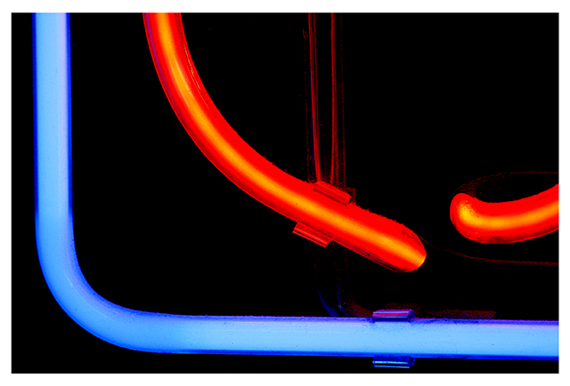
It WAS an open sign - I guess that's why I didn't do so well! |
Nope, its because its an abstract! I liked it and gave it an 8 :) |
|
 Photographer found comment helpful. Photographer found comment helpful. |
|
|
08/24/2004 08:32:46 PM |
| It WAS an open sign - I guess that's why I didn't do so well! |
|
|
|
08/24/2004 08:28:06 PM |
| So was it an open sign? I have to know! |
|
| Photographer found comment helpful. |
Comments Made During the Challenge  |
|
|
08/24/2004 05:04:09 PM |
| i'd probably find this more interesting if shot on an angle. maybe if you just rotated it slightly? |
|
| Photographer found comment helpful. |
|
|
08/23/2004 05:28:17 PM |
| not only is this a neon sign, but it's a neon sign with no meaning to me. I think we should introduce negative numbers. |
|
|
|
08/23/2004 12:36:20 PM |
| Not even PART of an open sign? How would we know? Seriously, though, using such a small part of the overall sign creates an interesting abstract - undoubtedly more interesting than the sign as a whole. |
|
| Photographer found comment helpful. |
|
|
08/19/2004 04:35:14 PM |
| Nice composition. I dislike the thick white frame though. |
|
| Photographer found comment helpful. |
|
|
08/18/2004 05:46:28 PM |
| I think its an open sign...........very brave, good clean sharp pic |
|
| Photographer found comment helpful. |
|
|
08/18/2004 04:30:01 PM |
| :)) Slightly tighter horizontal crop would have helped the balance, I think. |
|
| Photographer found comment helpful. |
|
|
08/18/2004 03:13:19 PM |
| Colors are great, composition doesn't really do anything for me but it's still a nice photo. 7 |
|
| Photographer found comment helpful. |
|
|
08/18/2004 09:24:28 AM |
| and also not a good picture |
|
|
|
08/18/2004 07:18:32 AM |
Yes, I'm sure it says "October," or "Onomatopoeia." :-)
Very nice composition and crop. Yours is one of those shots where I think to myself, "I wish I'd thought of that." Nice job! |
|
| Photographer found comment helpful. |
|
|
08/18/2004 04:53:20 AM |
|
|
|
08/18/2004 02:44:33 AM |
|
| Photographer found comment helpful. |
|
|
08/17/2004 10:09:16 PM |
funny! could be koi swimming around a fish bowl
extra points for being cheeky |
|
| Photographer found comment helpful. |
|
|
08/17/2004 08:28:29 PM |
| This is a great shot.... I wish you had thought about the title a little more :) |
|
| Photographer found comment helpful. |
Home -
Challenges -
Community -
League -
Photos -
Cameras -
Lenses -
Learn -
Help -
Terms of Use -
Privacy -
Top ^
DPChallenge, and website content and design, Copyright © 2001-2025 Challenging Technologies, LLC.
All digital photo copyrights belong to the photographers and may not be used without permission.
Current Server Time: 04/07/2025 01:00:01 PM EDT.