| Author | Thread |
Comments Made During the Challenge  |
|
|
08/17/2004 12:59:38 PM |
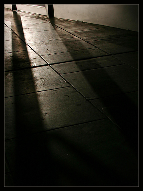
| Nice idea, good lighting and texture but it lacks a point of interest. Cropping out the window/door frame at the top would improve the image I think, it seems like unnecessary detail. |
|
 Photographer found comment helpful. Photographer found comment helpful. |
|
|
08/15/2004 06:25:15 PM |
| I think the perspective in this shot would stand out much better if some of the foreground black were cropped out. And it would stand out still better if the sidewalk extended almost all the way to the lead edge - that is, more sidewalk so there would be no need to crop. |
|
| Photographer found comment helpful. |
|
|
08/14/2004 09:37:48 PM |
|
| Photographer found comment helpful. |
|
|
08/12/2004 04:28:26 PM |
| Great light and shadows Love this one |
|
| Photographer found comment helpful. |
|
|
08/11/2004 08:42:44 AM |
| Hard to see anything, much less your VP... |
|
| Photographer found comment helpful. |
|
|
08/11/2004 05:41:46 AM |
| nice shot with a good feel! |
|
| Photographer found comment helpful. |
|
|
08/11/2004 04:07:11 AM |
| I don't think it meet the challenge requirements. |
|
| Photographer found comment helpful. |
|
|
08/11/2004 01:58:54 AM |
| Would have worked more under the parallel challenge I think but as an image I think it works very well |
|
| Photographer found comment helpful. |
|
|
08/10/2004 09:59:01 PM |
| Elegant and distinctive. 10 |
|
| Photographer found comment helpful. |
|
|
08/10/2004 09:51:44 PM |
|
| Photographer found comment helpful. |
|
|
08/10/2004 08:53:24 PM |
| I'm not quite seeing the converging parallels but I like it anyway. |
|
| Photographer found comment helpful. |
Home -
Challenges -
Community -
League -
Photos -
Cameras -
Lenses -
Learn -
Help -
Terms of Use -
Privacy -
Top ^
DPChallenge, and website content and design, Copyright © 2001-2025 Challenging Technologies, LLC.
All digital photo copyrights belong to the photographers and may not be used without permission.
Current Server Time: 04/08/2025 03:04:22 AM EDT.