| Author | Thread |
Comments Made During the Challenge  |
|
|
12/20/2002 09:11:34 AM |
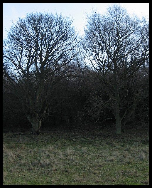
| Kind of an atmospheric photo, but the composition is flat. The two trees together compete for attention. I love the effect of the branches against the sky, but the grass in the foreground is dull and doesn't add anything. |
|
|
|
12/19/2002 03:46:40 PM |
| To make it even more spooky I'd have tried to darken the sky (and maybe lighted the nearest foreground) while keeping the woods about as they are. Think I'll take a flashlight... |
|
|
|
12/19/2002 07:05:04 AM |
| Everything looks real good here except the sky. I think a polarizing filter would've helped a lot. - Inspzil |
|
|
|
12/18/2002 06:26:41 PM |
| I liek this. I think it could do with being a bit darker, and maybe have a bit more contrast, but the it looks good anyway. I can't help thinking it looks wonkey tho, leaning down on the left. Prolly just the uneven trees |
|
|
|
12/18/2002 01:12:56 PM |
| Not a bad shot -- maybe a little *too* dark in the middle. |
|
|
|
12/17/2002 05:49:59 PM |
| I like how these two trees are "standing guard" over the forest. Sort of reminds me of a chapter in the Two Towers. (Can't wait to see the movie!) Were I to suggest any change, try creeping up closer to the trees and lowering your shooting angle, it would make the trees seem "larger than life". 8 Swash |
|
 Photographer found comment helpful. Photographer found comment helpful. |
|
|
12/17/2002 08:25:57 AM |
| The three tonal zones evenly distributed in the frame makes this picture a little static. Shot a little closer, at ground level, this same scene could have given better results, perhaps... |
|
|
|
12/16/2002 04:31:42 PM |
| In my personal opinion, the trees are a bit dark, and the white sky doesn't appeal to me. I have that same stupid white sky in my shot too though, so who am I to talk? I don't like it in my shot either. Definately appears to be "non humanly altered". Overall I think it's an ok shot. Good luck in the challenge. |
|
|
|
12/16/2002 10:05:34 AM |
| They certainly look dark. This may have worked better in B & W. The blue in the sky takes away from the shot IMHO. DPz |
|
|
|
12/16/2002 02:09:19 AM |
| I don't like how light the sky is in this shot. I think it would have looked better at dusk with a darker sky. it would have felt a lot more eerie. When the blue sky is covered up this shot looks a lot cooler. |
|
|
|
12/16/2002 01:40:27 AM |
| Felt the sky was too bright and the foreground too dull. |
|
Home -
Challenges -
Community -
League -
Photos -
Cameras -
Lenses -
Learn -
Help -
Terms of Use -
Privacy -
Top ^
DPChallenge, and website content and design, Copyright © 2001-2026 Challenging Technologies, LLC.
All digital photo copyrights belong to the photographers and may not be used without permission.
Current Server Time: 02/01/2026 08:59:12 AM EST.