| Author | Thread |
Comments Made During the Challenge  |
|
|
08/03/2011 09:47:19 AM |
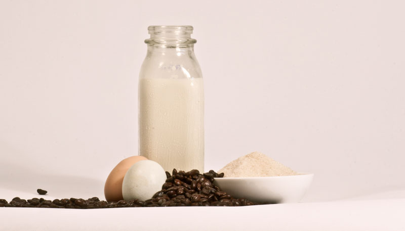
| Milk bottle is a little distracting since it's not in focus. Just sayin' |
|
 Photographer found comment helpful. Photographer found comment helpful. |
|
|
08/03/2011 09:14:58 AM |
| Love the show of ingredients for the recipe and the arrangement of elements is appealing, but there are a few things that could further boost the appeal of the shot. First I think the horizontal does not complement the image. A vertical presentation would be better because it would complement and flow with the shape of the milk bottle. Plus, a crop on the vertical would allow you to bring your viewers in for a closer look at the details and textures present in your ingredients. There is to much 'empty' space in the horizontal crop that does very little for your composition. A closer look would show off the textures of the coffee beans, the grains of sugar in the bowl, the textured surface of the eggs...Lighting also appears a bit flat - the milk and the sugar appear more biege than the typical pure white we normally think. Playing with the WB (white balance) on the camera could help adjust it to a more pure white (the backdrop also has a pinkish tone). Natural lighting (some tungsten bulbs give off a yellowish cast so choose your bulbs carefully in artificial lighting) could also help with maybe some small spotlights behind the bowl of sugar and the bottle of milk. The spotlights behind those two elements will 'outline' or deepen the the contours of the shapes of these items making them pop from the backdrop. |
|
| Photographer found comment helpful. |
|
|
08/02/2011 05:53:28 PM |
| Great decision to put the brown egg behind the white one, It helps to bring them out. Maybe a tighter crop on the right would have worked better? |
|
| Photographer found comment helpful. |
|
|
08/01/2011 11:51:30 AM |
| The focus could be a little sharper, and your whites a little whiter |
|
| Photographer found comment helpful. |
|
|
07/31/2011 01:59:46 PM |
| I like it, very simple, neutral tones dont make anything too gawdy. |
|
| Photographer found comment helpful. |
|
|
07/29/2011 03:51:32 PM |
| I'd like to see the background be a different color, like blue or even black to let the mild and powder contrast and become more three-dimensional. |
|
| Photographer found comment helpful. |
|
|
07/29/2011 03:36:59 PM |
| Nice and simple. The background seems to have an odd reddish (or at least an off white) tint that isn't so good. Maybe a slightly tighter crop, perhaps square would make the image a bit stronger as well. |
|
| Photographer found comment helpful. |
|
|
07/29/2011 12:07:50 PM |
|
| Photographer found comment helpful. |
Home -
Challenges -
Community -
League -
Photos -
Cameras -
Lenses -
Learn -
Help -
Terms of Use -
Privacy -
Top ^
DPChallenge, and website content and design, Copyright © 2001-2026 Challenging Technologies, LLC.
All digital photo copyrights belong to the photographers and may not be used without permission.
Current Server Time: 02/01/2026 10:47:38 AM EST.