| Author | Thread |
|
|
08/24/2004 10:49:21 PM |
Thanks for taking the time to critique this shot.
ISO is real touchy with the Olympus E-10 and
have pretty much resolved myself to shoot only at ISO 80.
I also had difficulty taking this shot without being seen doing so,
as this was a homelss woman in a crowd.
Being an open challenge, I could do any spot editing, though I
really wish I could have. I knew this would not appeal to many
members, as it isn't a "happy shot" and often people don't
wnat to see teh reality in daily life.
Again, thanks for taking the time here.
|
|
|
|
08/22/2004 09:58:06 AM |
Greetings from the Critique Club!
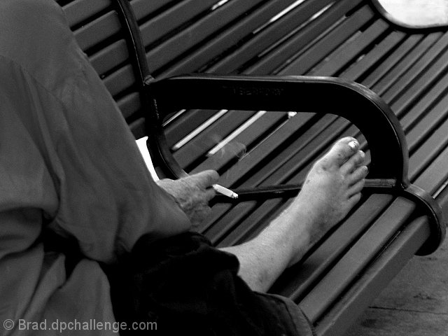
Good concept here. The over-the-shoulder viewpoint and the focal length used arrange the elements together just right for a great composition. The exposure is fine, but the slow shutter speed captured some motion blur in the foot which is rather distracting. A higher ISO would have allowed a faster shutter speed and avoided this; the increased noise possible with higher ISO would also complement the image.
In a journalistic photo like this, post-processing can be a difficult choice. Artistically, the image would benefit from burning the bright toenail a bit, and perhaps some of the brighter areas between the bench slats as well. It may also be effective to darken the midtones to make the image even more low-key. But the image is also fine without these embellishments if a more "true" statement is desired. |
|
 Photographer found comment helpful. Photographer found comment helpful. |
Comments Made During the Challenge  |
|
|
08/14/2004 05:41:09 AM |
| Focus seems a bit off, either from camera movement or subject movement. I also don't like the white area in the top right and think you should have cropped that out when you took the picture. I'm not sure I like the diagnal lines of the bench slats in this context. Doesn't fit with the homeless theme youi're portraying here. I do, however, like the B&W toning very much. It appears your subject didn't know he was being photographed and this kind of candid photography can be difficult. Really not a bad job overall. |
|
| Photographer found comment helpful. |
|
|
08/14/2004 03:34:20 AM |
| Very strong image, great composition. Love the gritty feel. .Well done! My first 10. |
|
| Photographer found comment helpful. |
|
|
08/12/2004 06:08:46 PM |
| I like but wish it was a little more in focus - good job |
|
| Photographer found comment helpful. |
|
|
08/09/2004 02:59:11 PM |
| great shot , good composition, great colors |
|
| Photographer found comment helpful. |
|
|
08/09/2004 09:19:10 AM |
| unstable shooting angle and lack of focus |
|
| Photographer found comment helpful. |
Home -
Challenges -
Community -
League -
Photos -
Cameras -
Lenses -
Learn -
Help -
Terms of Use -
Privacy -
Top ^
DPChallenge, and website content and design, Copyright © 2001-2025 Challenging Technologies, LLC.
All digital photo copyrights belong to the photographers and may not be used without permission.
Current Server Time: 04/07/2025 12:47:55 PM EDT.