| Author | Thread |
|
|
12/16/2002 05:06:31 PM |
Critique Club critique:
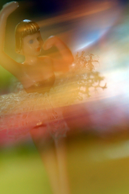
Composition/Content: Great subject and colors. Great idea too. The eye wants to go to the ballerina's face but goes to the two bright spots on top of her head and to the right of her. I would like to have seen the ballerina's arm fully in the picture.
Lighting: The lighter spots in the picture take the eye away from the ballerina. Otherwise, the lighting is right on.
Background: The background colors give the picture life.
Camera Work/Technical: It looks like you either started with the ballerina on the right and moved it left, or the camera on the left and moved it right. In either case it produced the same thing, part of the blur on top of the ballerina. If you started with the ballerina on the right and moved it to the left to end up in the position it is in, you might have avoided the blur being on top of the ballerina. Or, you might have done what indigo997 suggested below. Exposure is good.
Digital Processing: Colors, saturation and contrast look good.
My Opinion: You have all the makings of a great picture, just needed to change the center of interest. Nice job. |
|
 Photographer found comment helpful. Photographer found comment helpful. |
Comments Made During the Challenge  |
|
|
12/15/2002 06:28:10 AM |
| OK. Not sure what is creating the effect. Composition a bit off? |
|
| Photographer found comment helpful. |
|
|
12/14/2002 04:20:00 PM |
| Nice colours, composition. |
|
| Photographer found comment helpful. |
|
|
12/12/2002 07:23:57 AM |
| Nice abstract colors, a very moody image. Perhaps would have been neater if the ballerina's image was a less transluscent. |
|
| Photographer found comment helpful. |
|
|
12/11/2002 12:24:36 PM |
| Nice range of colours! Good blur. |
|
| Photographer found comment helpful. |
|
|
12/11/2002 08:25:52 AM |
| I like the colors in this picture. I thought, when I saw it in the thumbnail, that it was a real human ballerina. |
|
| Photographer found comment helpful. |
|
|
12/10/2002 09:44:09 AM |
| I like this. Your camera setting must of been perfect, as I can tell what it is. Good colors, light and focus. Nice. |
|
| Photographer found comment helpful. |
|
|
12/09/2002 06:56:55 PM |
| interesting abstraction. A little too much light blur though. The figurine looks too plastic as well. |
|
| Photographer found comment helpful. |
|
|
12/09/2002 05:03:30 PM |
| Mor careful placement of the subject would have benefitted this photo. |
|
| Photographer found comment helpful. |
|
|
12/09/2002 11:29:54 AM |
| I DON'T LIKE THE LIGHTING |
|
|
|
12/08/2002 07:56:56 PM |
| I think this was a good idea tho I don't really understand the blur being all over the place. I thought these girls usually just go around in circles. I'd like to see her more clearly. Did you try to use a flash to stop her motion and then leave the shutter open to catch the motion trail? |
|
| Photographer found comment helpful. |
Home -
Challenges -
Community -
League -
Photos -
Cameras -
Lenses -
Learn -
Help -
Terms of Use -
Privacy -
Top ^
DPChallenge, and website content and design, Copyright © 2001-2025 Challenging Technologies, LLC.
All digital photo copyrights belong to the photographers and may not be used without permission.
Current Server Time: 04/07/2025 12:45:47 PM EDT.