| Author | Thread |
Comments Made During the Challenge  |
|
|
08/10/2004 01:14:20 PM |
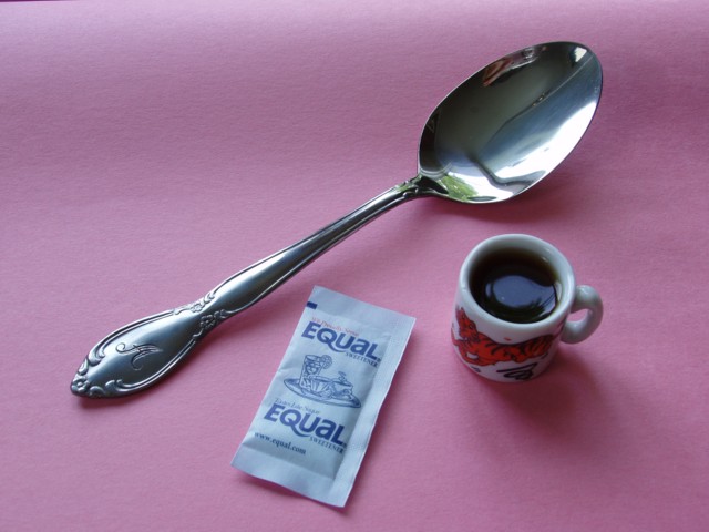
| Very nice interpretation of the challenge! The focus, composition and colors are all good. To me, the pink background stands out too much - you can really see the texture of it. Also I think the lighting would be better if if was coming from a different angle. The little coffee mug is so cute but it is really obscured because the shadow is falling in front of it - it the light was coming from the opposite direction so the shadow was falling behind the cup, I think, it would have added to the picture. |
|
 Photographer found comment helpful. Photographer found comment helpful. |
|
|
08/10/2004 11:16:55 AM |
| interesting concept but dont u think theres too much pink?! it kinda clashes with the red on the cup. |
|
| Photographer found comment helpful. |
|
|
08/08/2004 11:06:11 PM |
|
|
|
08/08/2004 04:24:08 AM |
|
|
|
08/06/2004 11:02:16 PM |
| The silver is washed out, but most people have difficulty with that. All in all, pretty good shot. 6 |
|
| Photographer found comment helpful. |
|
|
08/05/2004 06:18:02 PM |
| Not a bad picture. Not sure I like the pink background. It pops, but then the rest looks kind of boring to me. Just my opinion. |
|
|
|
08/05/2004 05:11:02 PM |
| nice shot. focus is a little soft, but that's ok; it's still one of my top picks. good luck. (btw, did you mean to put the title in all caps?) |
|
|
|
08/05/2004 10:18:27 AM |
Funny! :)
The reflection in the spoon is not great, you might think about using a light tent next time. |
|
| Photographer found comment helpful. |
|
|
08/05/2004 05:47:58 AM |
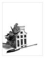
| You have an unfortunate reflection in the spoon. Your house plant winds up looking like a bit of green slime. Otherwise, this is very nicely composed! |
|
| Photographer found comment helpful. |
|
|
08/04/2004 09:47:49 PM |
| you shoulda white outed the tiiger,,, ditracting but none the less i like it bunches. |
|
| Photographer found comment helpful. |
|
|
08/04/2004 01:15:56 PM |
Your corner is showing. So to speak.. The edge of your backdrop / sheet of card is showing in the top left. Also the 'hump' in the backdrop near the top is distracting.
If you curved it deliberately, you really need to keep it curving upwards out of the picture, as the dark-light-dark transition catches the eye... |
|
| Photographer found comment helpful. |
|
|
08/04/2004 12:37:53 PM |
| i think that a simple white background would communicated the miniature a bit better. i find the pink/purple background takes away from the image somewhat. nice idea. |
|
| Photographer found comment helpful. |
|
|
08/04/2004 07:10:44 AM |
| nice idea, but not a very interesting perspective |
|
|
|
08/03/2004 10:30:14 PM |
| It´s good for my wife, she has stomach problems... |
|
Home -
Challenges -
Community -
League -
Photos -
Cameras -
Lenses -
Learn -
Help -
Terms of Use -
Privacy -
Top ^
DPChallenge, and website content and design, Copyright © 2001-2025 Challenging Technologies, LLC.
All digital photo copyrights belong to the photographers and may not be used without permission.
Current Server Time: 04/07/2025 02:21:26 PM EDT.