| Author | Thread |
Comments Made During the Challenge  |
|
|
08/07/2004 05:33:33 AM |
|
 Photographer found comment helpful. Photographer found comment helpful. |
|
|
08/05/2004 02:37:14 PM |
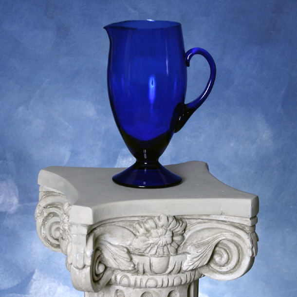
| I think I would have liked this one better with a tad more empty space above the glass; it seems a bit imbalanced with so much more space to the sides, and with so much of the column/table on the bottom. The reflection in the middle is also a little distracting. I love the colours and the basics of the photo, though. 6 |
|
| Photographer found comment helpful. |
|
|
08/05/2004 01:27:28 AM |
| The lighting is pretty nice, good and even, but the big highlight in the pitcher is distracting. Also the pedestal is a little to bright compared to the pitcher, which seems to be the focal point of the composition and the pedestal is trying to steal its thunder. We can't let that happen... :) |
|
| Photographer found comment helpful. |
|
|
08/03/2004 09:15:53 AM |
| I really like this picture. I like the contrast between the blues. |
|
| Photographer found comment helpful. |
|
|
08/02/2004 08:30:18 AM |
| Would've been better without the blue background |
|
| Photographer found comment helpful. |
Home -
Challenges -
Community -
League -
Photos -
Cameras -
Lenses -
Learn -
Help -
Terms of Use -
Privacy -
Top ^
DPChallenge, and website content and design, Copyright © 2001-2025 Challenging Technologies, LLC.
All digital photo copyrights belong to the photographers and may not be used without permission.
Current Server Time: 04/07/2025 12:18:53 AM EDT.