| Author | Thread |
Comments Made During the Challenge  |
|
|
08/08/2004 01:25:24 PM |
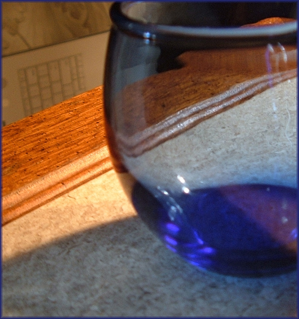
| This is nice. I think a less distracting background would help and also the focus seems to be on the table edge as opposed to the glass object. I think the other way around might help the composition a bit. Maybe try it will a solid background, like white which would help the blue pop more. just my 2 cents though. :-) |
|
|
|
08/08/2004 02:20:50 AM |
| Well done, Except the object in the left of the background doesn't seem to fit the photo (only my opinion) a 5 from me |
|
|
|
08/05/2004 05:40:43 PM |
| the background seems distracting to me |
|
|
|
08/05/2004 01:52:46 AM |
| I like this composition. Well, with a different background I would. The keyboard is _mondo_ distracting. Also, the photo is pretty much universally blurry. The blue should be in focus I think. |
|
|
|
08/04/2004 11:07:04 PM |
| Very nice composition in terms of color contrast, balance and light and dark |
|
|
|
08/04/2004 07:18:49 PM |
| Unconventional but a great way to break up space. Excellent balance of colour and shade. |
|
|
|
08/02/2004 04:52:52 AM |
|
Home -
Challenges -
Community -
League -
Photos -
Cameras -
Lenses -
Learn -
Help -
Terms of Use -
Privacy -
Top ^
DPChallenge, and website content and design, Copyright © 2001-2025 Challenging Technologies, LLC.
All digital photo copyrights belong to the photographers and may not be used without permission.
Current Server Time: 04/09/2025 01:42:00 PM EDT.