| Author | Thread |
Comments Made During the Challenge  |
|
|
07/30/2004 05:03:04 AM |
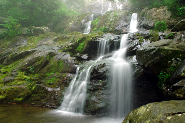
| Really nice long exposure, might have liked it if you'd moved to the left a little to get rid of the rock on the bottom RHS or to make the waterfall more centred. |
|
 Photographer found comment helpful. Photographer found comment helpful. |
|
|
07/29/2004 10:11:49 PM |
| You captured the water beautifully. I would rather see the large rocks on the right side cropped leaving the falls close to the border. The hazy look on the left of the falls is good. You're probably being scored lower for not having the name of the band on the cover too. |
|
| Photographer found comment helpful. |
|
|
07/28/2004 02:41:28 PM |
|
| Photographer found comment helpful. |
|
|
07/27/2004 07:29:50 PM |
I originally said it didn't meet the challenge, I was wrong. I misunderstood the rules - sorry.
Message edited by author 2004-08-02 07:23:23. |
|
| Photographer found comment helpful. |
|
|
07/27/2004 06:44:21 AM |
| This is a great pic, but not much of an album cover.... especially with no text |
|
| Photographer found comment helpful. |
|
|
07/27/2004 02:57:44 AM |
Very good shot...perpective/angle is very pleasing.
Shutter speed is good. Focus is good.
|
|
| Photographer found comment helpful. |
|
|
07/26/2004 06:29:58 PM |
| I'd have liked to see you take a bigger chance with this one. Seems like a bit too safe on the subject matter. Certainly a great photo, though. |
|
| Photographer found comment helpful. |
|
|
07/26/2004 12:38:29 PM |
| lovely composition but I wonder if using cascaders instead on cascades would be more to the pont of the challenge? |
|
| Photographer found comment helpful. |
|
|
07/26/2004 08:07:59 AM |
| nice job or showing movement. good exposure too. |
|
| Photographer found comment helpful. |
|
|
07/26/2004 07:58:49 AM |
This one doesn't work too well for me as a name or album cover. It seems like the band name was shoehorned to fit a photo that was taken during the time frame. You were probably unaware until entering, that text could be added for this one. That probably would have helped convince me this was an album cover. I almost missed that too, but I had a couple of hours left to work on it. I sympathise because this is probably hurting you in the scores.
The photo is quite nice. The composition is great and the blurring water is very effective. It's all over a bit contrasty, especially the rocks on the right side of the frame. The middle values are a bit dark and there is very little detail in the shadow areas. This is a shot that could be heightened dramatically with some highlight dodging. |
|
| Photographer found comment helpful. |
|
|
07/26/2004 02:45:10 AM |
| Great shot. I think some dodging and burning to add contrast would really bring it to life. |
|
| Photographer found comment helpful. |
|
|
07/25/2004 09:31:46 PM |
| You should have added titles to the picture and cropped it square like an album cover to meet this challenge. |
|