| Author | Thread |
|
|
08/02/2004 03:41:12 PM |
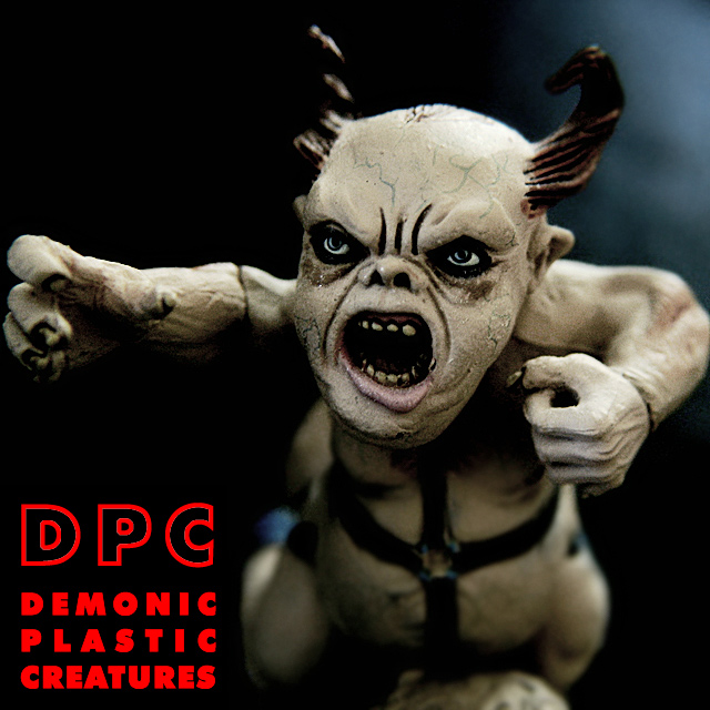
| Thanks for all the comments. The text was actually anti-aliased, I just forgot to remove my old white text layer from beneath the red, giving it some jaggedy-looking glowing edges; I run in 1280x1024, so I didn't notice until it was too late. Oh well :) |
|
Comments Made During the Challenge  |
|
|
08/01/2004 02:01:00 AM |
| I really don't like you're choice of text, but this is the best fucking photo in this challenge, and I like the name. 9. |
|
 Photographer found comment helpful. Photographer found comment helpful. |
|
|
07/31/2004 01:50:30 AM |
| Great job with the shallow DOF to isolate the face. Background color and lighting is also exceptional for conveying this scary psudo monter. Well done. |
|
| Photographer found comment helpful. |
|
|
07/30/2004 04:54:43 PM |
|
| Photographer found comment helpful. |
|
|
07/29/2004 12:30:49 PM |
| Scary--don't think I would like this music, but very creative cover. |
|
| Photographer found comment helpful. |
|
|
07/28/2004 04:37:28 PM |
| O this is great! I love this. Title and image, you have made them work like synchronized swimmers. |
|
| Photographer found comment helpful. |
|
|
07/27/2004 08:35:59 PM |
| Wonderful idea and image. I think the red text is way too strong though. |
|
| Photographer found comment helpful. |
|
|
07/27/2004 04:41:54 AM |
The "Ugly Tree" this guy fell out of must have been tall! With lots of branches!
Very good job at matching title and picture.
Well done. |
|
| Photographer found comment helpful. |
|
|
07/26/2004 09:02:14 PM |
|
| Photographer found comment helpful. |
|
|
07/26/2004 07:04:03 PM |
| The photo is technically and aesthetically perfect. My only complaint is the jaggies on the text, which can be easily fixed with anti-aliasing. 9! |
|
| Photographer found comment helpful. |
|
|
07/26/2004 04:43:07 PM |
| Really cool, I would definitely see it on an album. DOF and lighting is very good. (9) |
|
| Photographer found comment helpful. |
|
|
07/26/2004 09:26:04 AM |
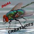
| I had the same idea for the name, but no plastic creature. Good job! |
|
| Photographer found comment helpful. |
|
|
07/26/2004 08:22:11 AM |
| Yikes!! Great fun, spooy too! 8 |
|
| Photographer found comment helpful. |
|
|
07/26/2004 07:57:13 AM |
| i like the whole design and picture. the one thing i am not totally sold on is the bright red color for the lettering. everything else in the picture is fairly dark, and the bright red seems a little out of place. i do like how you've lined all the lettering up evenly. |
|
| Photographer found comment helpful. |
|
|
07/26/2004 03:28:48 AM |
| Hehe, great shot :) I'm not to keep on the red text tho, I would have made it blue like the background colour. Still, very cool shot. 9 |
|
| Photographer found comment helpful. |
|
|
07/26/2004 01:50:11 AM |
for heavy metal, certainly, looks like a cd cover.........
sorry not a member, cant vote |
|
| Photographer found comment helpful. |
Home -
Challenges -
Community -
League -
Photos -
Cameras -
Lenses -
Learn -
Help -
Terms of Use -
Privacy -
Top ^
DPChallenge, and website content and design, Copyright © 2001-2025 Challenging Technologies, LLC.
All digital photo copyrights belong to the photographers and may not be used without permission.
Current Server Time: 04/07/2025 01:01:20 PM EDT.