| Author | Thread |
|
|
08/05/2004 01:40:01 AM |
Hello John from the Critique Club
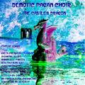
I havent a clue what the title stands for but I do like the style of words you used (The font) it looks like text on a rock album
You have used too many objects with very different patterns and it makes me almost dizzy trying to look at it.
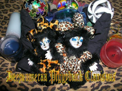
I like the two faces you have in your image and I think it would have helped if you focused on them with a plain background and left the other items out.
A plain background would also make your text stand out.
It seems unfair to vote you so low when you have obviously tried the colour is good ,but please try to remember that simple is sometimes better and there were a whole lot of excellent images in this challenge, and D P C have a very high standard
I hope that you will continue to enjoy your photography and have better luck in your future challenges
If you have any questions please feel free to P M me
Regards
Sally |
|
 Photographer found comment helpful. Photographer found comment helpful. |
|
|
08/01/2004 08:03:08 PM |
| Congrats on the brown ribbon. |
|
Comments Made During the Challenge  |
|
|
07/31/2004 02:32:49 PM |
| I find this too cluttered for my liking. You should rather have isolated some element of it - probably the dolls, which look really interesting. |
|
| Photographer found comment helpful. |
|
|
07/30/2004 05:56:53 AM |
| Not knowing what the words represent makes it hard to judge this picture. I am assuming that it's the bank clan? If that is it, the bank is to hard to find. The picture is to cluttered to have much of an impact. |
|
| Photographer found comment helpful. |
|
|
07/29/2004 09:50:23 AM |
| Very cluttered picture, too many items fighting for attention. |
|
| Photographer found comment helpful. |
|
|
07/28/2004 05:46:01 AM |
I'm not getting the title.
Good effort. I like the font on the text as well |
|
| Photographer found comment helpful. |
|
|
07/27/2004 11:43:38 AM |
|
| Photographer found comment helpful. |
|
|
07/27/2004 11:28:57 AM |
| This image seems way too busy. It's hard to tell what anything in this jumble of stuff really is, and the items don't really interest me much. In addition, the text you've chosen is nearly impossible to read due to both the style and colors used. |
|
| Photographer found comment helpful. |
|
|
07/27/2004 09:31:21 AM |
|
| Photographer found comment helpful. |
|
|
07/26/2004 09:56:36 AM |
Not really sure what you are going for here but here's my comments. First, I have no idea what the title is with the exception of the piggybank and even then, I see no piggybank reference in the shot. Maybe I'm being to literal.
Second the shot seems very cluttered and busy. All the patterns on the materials competeing for my attention makes me look all over the place and ends up being confusing. The candles add nothing to the shot for me and the flash or light on the jigsaw ball in the upper left is also distracting. A 4 |
|
| Photographer found comment helpful. |
|
|
07/26/2004 09:02:57 AM |
The band name sounds like at least one (if not two) made-up word was used which seems a bit like cheating. The photo is just terrible, I'm sorry to say. It appears to be a jumple of random objects. I can make out scary cat clown slippers (or puppets? really hard to tell), some half-used votives, and
some Christmas ornaments. This mess looks barely composed and considered and then shot with flash which flattens everything out. The text is very hard to read against all the clutter. |
|
| Photographer found comment helpful. |
|
|
07/26/2004 02:47:10 AM |
| What does Deezuumeraa mean? I think this shot is too busy for an album cover - too much going on. I can't make out whats what, and the text blends in too much with the photo, making it unreadable and just a distraction overall. |
|
| Photographer found comment helpful. |
|
|
07/25/2004 08:25:03 PM |
|
| Photographer found comment helpful. |
Home -
Challenges -
Community -
League -
Photos -
Cameras -
Lenses -
Learn -
Help -
Terms of Use -
Privacy -
Top ^
DPChallenge, and website content and design, Copyright © 2001-2025 Challenging Technologies, LLC.
All digital photo copyrights belong to the photographers and may not be used without permission.
Current Server Time: 04/07/2025 12:53:28 PM EDT.