| Author | Thread |
Comments Made During the Challenge  |
|
|
08/01/2004 02:19:36 PM |
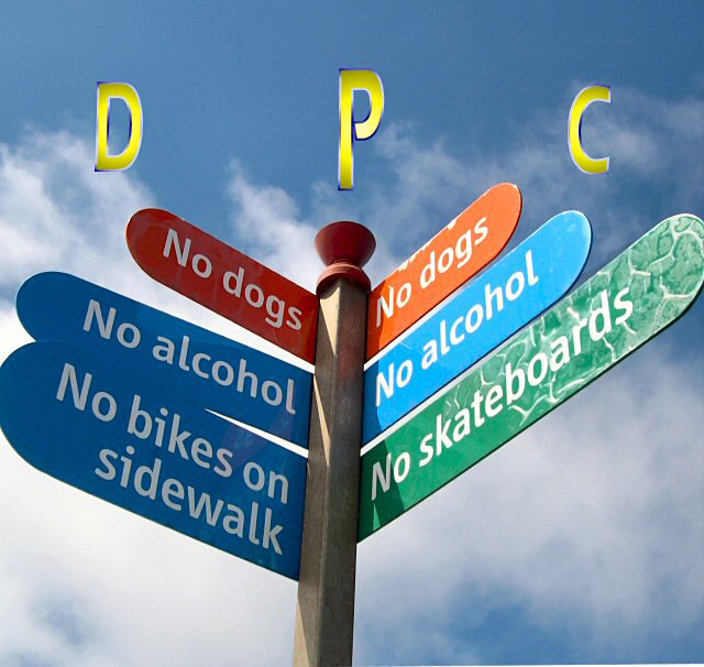
| I like it, catchy title - I think it would have been even better with the full name in type on the image, but a great find nonetheless! |
|
 Photographer found comment helpful. Photographer found comment helpful. |
|
|
07/31/2004 06:29:29 AM |
| wonderful image. great capture |
|
| Photographer found comment helpful. |
|
|
07/30/2004 12:48:31 PM |
|
| Photographer found comment helpful. |
|
|
07/29/2004 06:13:55 PM |
| that is a hell of a funny sign ... the photo itself does not work so well for me ... also the DPC seems a bit boring |
|
| Photographer found comment helpful. |
|
|
07/29/2004 05:18:46 AM |
| Cropping bothers me a bit but still a good shot |
|
| Photographer found comment helpful. |
|
|
07/28/2004 01:11:09 PM |
| I like the subject, but the composition doesn't quite work for me. It seems a little tight on the left and right sides. Some fill flash might have been able to clear up the shadows in the center as well. The colors and sky are great though. |
|
| Photographer found comment helpful. |
|
|
07/28/2004 12:30:35 PM |
| While the idea is ok, it it has a few floors in the photo. It needs to be straighted more! I can see that you have tried and now there is a gap on the bottom right hand side that should have been cropped. The hard shadow could have been softened if you had used fill flash. Nice sky, nice colour and well framed. |
|
| Photographer found comment helpful. |
|
|
07/27/2004 09:27:16 AM |
|
| Photographer found comment helpful. |
|
|
07/26/2004 08:56:50 PM |
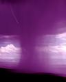
Man, that place is NO fun at all!
Good take on the challenge but not sure how it would really play as an album cover. The right side is overlit while the left is just about perfect. A 7 |
|
|
|
07/26/2004 01:44:26 PM |
| Wow. Who made the signs? Good effort. |
|
| Photographer found comment helpful. |
|
|
07/26/2004 08:50:20 AM |
| Very good band name. The photo works really well, although it could use some perspective repair. I really dislike the way the text looks. |
|
| Photographer found comment helpful. |
|
|
07/26/2004 01:57:16 AM |
| I think this would be better if it was symmetrical, with the post being vertical. |
|
| Photographer found comment helpful. |
Home -
Challenges -
Community -
League -
Photos -
Cameras -
Lenses -
Learn -
Help -
Terms of Use -
Privacy -
Top ^
DPChallenge, and website content and design, Copyright © 2001-2025 Challenging Technologies, LLC.
All digital photo copyrights belong to the photographers and may not be used without permission.
Current Server Time: 04/07/2025 01:00:12 PM EDT.