| Author | Thread |
Comments Made During the Challenge  |
|
|
12/15/2002 09:37:02 PM |
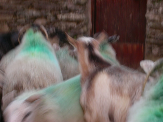
| The motion blur doesn't seem to add to this shot. It looks just like blurryness caused by a shaky hand. 2 |
|
|
|
12/15/2002 08:50:04 PM |
|
|
|
12/15/2002 11:46:54 AM |
|
|
|
12/15/2002 12:05:30 AM |
1)Does the photo fit the challenge?(3)
2)Color(3)
3)Composition(4)
4)Focus(2)
5)Background(3)
6)Lighting(4)
7)Title(4)
Overall Score:3.28 rounded to 3
Commentary:
Visually there really is nothing pleaseing about this shot. The highlights of the shot are lighting. Seems to be a bit dark. Not harsh though. WEll that is all I can say here. Sorry I was critical. :-(
John (TurboTech) |
|
|
|
12/12/2002 01:53:47 PM |
| Like the painted effect this has - would prefer it immensely if we had a face facing us. |
|
|
|
12/11/2002 11:37:45 PM |
| I think this would have been a really nice picture if it was less blurry, or at least one object was completely stopped. That aside, I think the composition is done well - no distractions and eye is drawn to the odd animal out. |
|
|
|
12/09/2002 11:55:32 AM |
| The photo is a little tight (meaning I think you tried to crap too much into a small space). It is because of this that the photo looks like some blurry animals standing around. If this photo was taken from another angle, where I could maybe see them moving towards a door, I would of scored higher. jgillard3 |
|
Home -
Challenges -
Community -
League -
Photos -
Cameras -
Lenses -
Learn -
Help -
Terms of Use -
Privacy -
Top ^
DPChallenge, and website content and design, Copyright © 2001-2026 Challenging Technologies, LLC.
All digital photo copyrights belong to the photographers and may not be used without permission.
Current Server Time: 02/01/2026 10:37:13 AM EST.