| Author | Thread |
|
|
08/04/2004 10:32:37 PM |
| Hahaha. Wish you had done your original idea! You have a great eye for photography and design work. I am a fan of your work in general. Keep inspiring. |
|
 Photographer found comment helpful. Photographer found comment helpful. |
Comments Made During the Challenge  |
|
|
08/01/2004 06:43:42 PM |
| Outstanding concept. Love it! |
|
| Photographer found comment helpful. |
|
|
08/01/2004 02:50:47 PM |
| Heh heh...great title. I like the design. |
|
| Photographer found comment helpful. |
|
|
07/31/2004 05:32:25 AM |
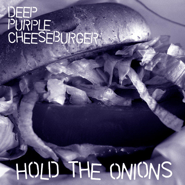
| I like the idea but I think the colour has messed with the contrast or something. Just dosen't seem to have a punch to it. |
|
| Photographer found comment helpful. |
|
|
07/30/2004 02:59:54 PM |
kind of a cop out on the band name...
deep purple is fairly well known around here.
where's the beef?
|
|
|
|
07/30/2004 09:39:09 AM |
|
| Photographer found comment helpful. |
|
|
07/30/2004 02:08:38 AM |
| The thumbnail on this really grabbed my attention. I like the actual image, there's just something about it that I think would do well as an album cover. 8 |
|
| Photographer found comment helpful. |
|
|
07/29/2004 10:59:50 AM |
| I like this cover.....creative wording....I like the idea, and the gritty feel of it...I also like the purple-overtones. |
|
| Photographer found comment helpful. |
|
|
07/28/2004 01:17:52 PM |
| A little busy at the bottom of the shot imho. That said, the lighting used and focus is great. |
|
| Photographer found comment helpful. |
|
|
07/28/2004 11:37:10 AM |
| Cool! Tasty composition, matching fonts, and it's funny! :-)) Good luck, go for a ribbon! (10) |
|
| Photographer found comment helpful. |
|
|
07/27/2004 08:33:16 PM |
| Clever title - especially the album title "Hold the Onions" Good use of desat. |
|
| Photographer found comment helpful. |
|
|
07/27/2004 07:30:05 PM |
|
| Photographer found comment helpful. |
|
|
07/27/2004 12:17:04 PM |
| This is cool, I'd expect to see it on an underground punk album. Nice tone too. (8) |
|
| Photographer found comment helpful. |
|
|
07/27/2004 03:20:22 AM |
The titles and picture on this one are killer.
Good sense of humour, very creative. |
|
| Photographer found comment helpful. |
|
|
07/26/2004 10:12:02 AM |
| Okay, where's the beef? I can't even see the burger part, I know, being literal but the main part of the shot is the tomato. The lettering is good but a bit big to me. And the purple is okay but not a lot of contrast, nothing to make it jump out at me on the shelf. A 7 |
|
| Photographer found comment helpful. |
|
|
07/26/2004 08:41:19 AM |
| The best one of the lot. Simple. Original. Funny, but realistic ... 10 |
|
| Photographer found comment helpful. |
|
|
07/26/2004 02:24:17 AM |
| I like the text effect :) The photo looks more blue than purple but hey, it's all good :) |
|
| Photographer found comment helpful. |
Home -
Challenges -
Community -
League -
Photos -
Cameras -
Lenses -
Learn -
Help -
Terms of Use -
Privacy -
Top ^
DPChallenge, and website content and design, Copyright © 2001-2025 Challenging Technologies, LLC.
All digital photo copyrights belong to the photographers and may not be used without permission.
Current Server Time: 04/07/2025 01:00:34 PM EDT.