Hello and greetings from the Critique Club,
As I voted on your photo, I�ll tell you what I voted and why-
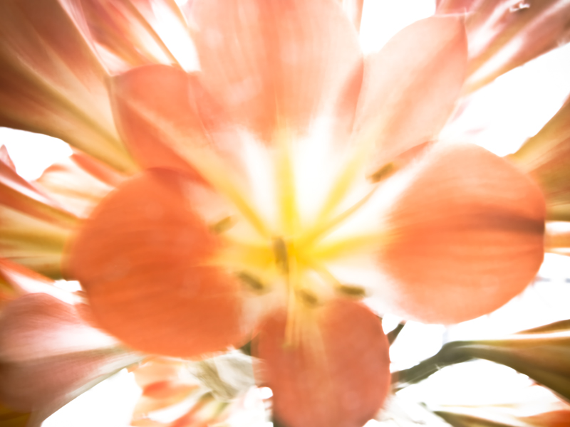
I gave your entry a 5, and if I were to explain it succinctly, I would say that you did a good job of capturing a lightness and brevity, but that the photo, to me, feels very incomplete and unsure of what it was trying to be. It is somewhat lacking of direction, and while I do like the bright colors and appreciate the blown areas, it does not seem as though it altogether completes the message.
As far as the more high key approach goes, it works well for this subject matter, but the contrast is not quite lowered to a level typical of a high key shot. It also resides in an area that is neither completely blurred nor sharp. While these rules or guidelines need not be followed, it�s useful to know them and know that to a great extent they guide what people expect in photos. I think, in this case, a more solid and concerted effort towards a high key shot would have benefitted things. I think it also would have worked to have an initially somewhat sharper photo and then go for an impressionist approach (which you somewhat have here). What is somewhat awkward though, is that while you�ve gone for the impressionist approach, and the image is not focused, the portions of the flower that define its shape are very sharp because of the contrast that is still present in them. This is particularly true of the edges of the petals, and I think they destroy some of the feeling of a painting that it seems you were going for.
|