| Author | Thread |
Comments Made During the Challenge  |
|
|
02/01/2011 10:23:16 PM |
| Personally, I'm not a fan of the white washed look. |
|
|
|
01/31/2011 08:48:45 PM |
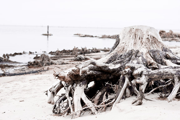
| great shot but fire representation should have helped a little |
|
|
|
01/29/2011 01:11:51 PM |
| Not really seeing the fire in this one... |
|
|
|
01/28/2011 12:03:40 PM |
| I'm still trying to figure out where the fire is. Was this tree burned down? |
|
|
|
01/26/2011 11:22:01 PM |
| I am not sure where the fire element is (the sun?) but I like the picture. |
|
|
|
01/26/2011 09:26:25 PM |
|
|
|
01/26/2011 01:35:59 PM |
| The texture in the wood is great. It's very distracting, though, that the horizon isn't level. Also, the way the roots are cut off on the right feels a little jarring. Maybe a more panoramic crop would look better, keeping the roots from being cut off on the right but also giving more open space on the left. |
|
Home -
Challenges -
Community -
League -
Photos -
Cameras -
Lenses -
Learn -
Help -
Terms of Use -
Privacy -
Top ^
DPChallenge, and website content and design, Copyright © 2001-2026 Challenging Technologies, LLC.
All digital photo copyrights belong to the photographers and may not be used without permission.
Current Server Time: 02/01/2026 08:15:01 AM EST.