| Author | Thread |
Comments Made During the Challenge  |
|
|
07/27/2004 03:29:06 PM |
Ah what the hell. I'll have two cups!
Well done. Nice image. |
|
 Photographer found comment helpful. Photographer found comment helpful. |
|
|
07/27/2004 01:58:42 AM |
|
|
|
07/26/2004 11:51:32 AM |
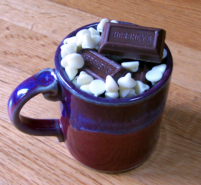
| Uhh... I think WB is definitely wrong here, the chocolate has bluey shades. Lighting is too harsch, the reflection of the flash is too strong on the handle, and there are blow outs and aberration on the white sweets. The background isn't impressive either. The angle you chose is good, but there are still a lot to improve. Use diffused lights and set up WB for indoor bulb. Avoid using too dark and too light elements on the photo if you are not sure about light metering with great contast. I was hesitating about 2, but for the composition I give you the higher value. (3) |
|
|
|
07/24/2004 06:27:21 PM |
| Poor lighting really hurt. Not sure the Pergo wood background adds much to the feel. |
|
|
|
07/24/2004 03:00:43 AM |
| I like the colour combinations in this image. The light is a bit flat for my liking. I think a lower light could have added some more shadows and detail into the little white chocolates. I think the central composition works. I would have added a little more room all round and added a border. |
|
| Photographer found comment helpful. |
|
|
07/23/2004 03:00:04 PM |
| The colouring in this photo seems to clash to me? Perhaps on a darker surface the cup may have looked better. Also the reflection on the handle seems too bright. |
|
| Photographer found comment helpful. |
|
|
07/23/2004 12:11:08 PM |
| Nice clear shot, but the whole photo seems to have a blueish tinit to it that makes the chocolate look rather unappealing IMO. |
|
| Photographer found comment helpful. |
|
|
07/23/2004 01:41:18 AM |
| Looks delicious. Everything works for me except the wood-grain below the cup. Lighting could be softened as well. Nice composition and use of DoF. |
|
| Photographer found comment helpful. |
|
|
07/21/2004 02:54:21 PM |
| the table is distracting, simple white background might have worked better. |
|
Home -
Challenges -
Community -
League -
Photos -
Cameras -
Lenses -
Learn -
Help -
Terms of Use -
Privacy -
Top ^
DPChallenge, and website content and design, Copyright © 2001-2026 Challenging Technologies, LLC.
All digital photo copyrights belong to the photographers and may not be used without permission.
Current Server Time: 02/01/2026 09:23:35 AM EST.