| Author | Thread |
Comments Made During the Challenge  |
|
|
07/27/2004 11:51:13 PM |
| NICE DOF and focus drawing me in. How did this look in color? Be a bit more dramatic with the color, even muted some, IMO. good job |
|
 Photographer found comment helpful. Photographer found comment helpful. |
|
|
07/27/2004 08:12:34 PM |
| not sure if the reflections work very well on an otherwise great photo |
|
| Photographer found comment helpful. |
|
|
07/27/2004 02:07:23 PM |
| i think the shot would have been a lot more striking if it was in color. that being said, you have a good dof and i like the abstract composition. |
|
| Photographer found comment helpful. |
|
|
07/27/2004 11:12:58 AM |
| Mike really likes this photo, Lina likes the white shades at the back, I like the close-up and the lighting |
|
| Photographer found comment helpful. |
|
|
07/27/2004 09:42:02 AM |
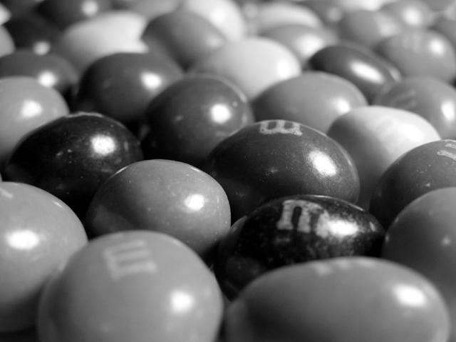
| It's wierd to see M&M's b/w but I think it's a really interesting image! |
|
| Photographer found comment helpful. |
|
|
07/25/2004 09:51:55 PM |
| Nice idea and good point of view, but it seems like it would have worked better in color. |
|
| Photographer found comment helpful. |
|
|
07/25/2004 03:52:53 PM |
| It's a nice photo, with good focus, but I think this would of worked better in colour |
|
| Photographer found comment helpful. |
|
|
07/25/2004 04:37:44 AM |
|
| Photographer found comment helpful. |
|
|
07/24/2004 02:39:08 PM |
| this might have looked better in color, no? |
|
| Photographer found comment helpful. |
|
|
07/23/2004 09:49:03 AM |
| Coloured would have been good |
|
| Photographer found comment helpful. |
|
|
07/23/2004 01:24:08 AM |
| It's an interesting take on the challenge - I never would have suspected someone would use B&W for this. The lighting needs to be softened down a lot - and more DoF would help as well. |
|
| Photographer found comment helpful. |
|
|
07/22/2004 10:35:17 PM |
| Just a personal opinion...but I think this would have been a whole lot more effective in color...especially since "they" asked the whole world to vote on a new color. |
|
| Photographer found comment helpful. |
|
|
07/22/2004 02:54:05 AM |
| A 10 if it was in colour. 6 |
|
| Photographer found comment helpful. |
|
|
07/21/2004 06:02:16 PM |
|
| Photographer found comment helpful. |
|
|
07/21/2004 02:09:39 PM |
| not the best choice of shot or challenge to use B & W |
|
| Photographer found comment helpful. |
|
|
07/21/2004 10:14:10 AM |
|
| Photographer found comment helpful. |
|
|
07/21/2004 10:12:10 AM |
| i think these would look better in colour |
|
| Photographer found comment helpful. |
|
|
07/21/2004 10:00:27 AM |
| For this image, since we don't see the colors, it is vital that you show "m"s on every candy. Otherwise the shot looks hasty and unplanned. Good DOF. |
|
| Photographer found comment helpful. |
|
|
07/21/2004 05:13:18 AM |
softer light, the m in the lower right corner should be in focus but is not.
Its where my eyes stop in the picture. |
|
| Photographer found comment helpful. |
|
|
07/21/2004 01:03:26 AM |
| But the best thing about M&Ms is their color!!! |
|
| Photographer found comment helpful. |
Home -
Challenges -
Community -
League -
Photos -
Cameras -
Lenses -
Learn -
Help -
Terms of Use -
Privacy -
Top ^
DPChallenge, and website content and design, Copyright © 2001-2026 Challenging Technologies, LLC.
All digital photo copyrights belong to the photographers and may not be used without permission.
Current Server Time: 02/01/2026 07:23:22 AM EST.