| Author | Thread |
|
|
12/13/2002 10:15:11 PM |
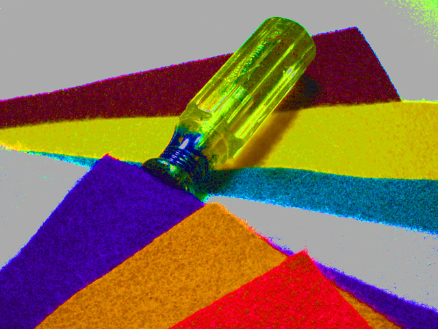
I like this image. I like all the post processing and the saturated colors. I gave it a 7 originally.
Compositionally it is perfectly balanced- The three colored papers, red, yellow, blue are mirrored by a different red, yellow blue, separated by the grey and brought back together by the screwdriver. All the diagonal lines make interesting patterns and lead the viewers eye around and around the picture. There aren't too many lines leading out of the picture because just as many lead back in. Without doing the reule of thirds thing you have balanced three compositon items in a pleasing upper right to lower left diagonal. Really, it is a textbook composition masterpiece.
I also love the textures in the picture. The colored things could be paper or felt or even sand paper. They are rough or soft, I can't decide which. The grey is definatlely slippery smooth and the screwdriver handle is round and ridged. The roundness of the screwdriver contrasts with the straight lines of the paper stuff. Oh, it is all so balanced. Sorry to repeat myself.
Want some more balance/contrast ideas? How about transparent vs opaque- nicely done. ANd the only one shadow under the screwdriver? Interesting that the transparent object is the only one to cast a shadow.
Al I said, I like the "over" processed look that others disagreed with. I suppose I can see the point about the green speckles in the upper right and now that the challenge rules are off you can go clone those away. While you are at it, take out the few speckles on the grey in the middle. But please leave all the other color variations. Like on the maroon, I like that the shadow is greenish. And I like the yellow speckles on the red.
So why did I give it such a poor score? Where is the blade of the screwdriver? It just disappears like an Escher drawing and that bugs me. I like to know what I'm looking at. But that's just me. And maybe I thought "Why the screwdriver anyways?" Also the title confuses me. I keep looking at those terrific colors and wondering where I'm supposed to be seeing Blue from green and yellow.
This picture should really have done much better than it did. I hope you fix it up and keep it in your portfolio.
From the critique club - just one amateurs opinion. |
|
Comments Made During the Challenge  |
|
|
12/08/2002 10:47:39 PM |
| isn't it yellow and blue make green? |
|
|
|
12/08/2002 08:53:58 AM |
| The attempt to oversaturate the colors also made the background speckled with colors, esp. in the top right corner. These elements are distracting. |
|
|
|
12/07/2002 12:20:20 PM |
| What in the world happened here? Looks to be a LOT of post processing. The upper right corner has some strange yellow coloring in it, and there are speckles all over this shot. Maybe try it without what ever post processing you did, and it could be a very nice shot, but as is, I'm not too sure it appeals to me. Good luck in the challenge. |
|
|
|
12/06/2002 02:13:13 PM |
| Over sharpened. The yellow blob in the top right corner is distracting. Why not have put the yellow handle over the blue material and let green show through. This appears to be over colored enhanced. Good idea, poor execution. PTL 3 |
|
|
|
12/06/2002 12:04:51 PM |
|
|
|
12/05/2002 06:17:10 PM |
| Nice colours, but they look over saturated. |
|
|
|
12/03/2002 04:01:00 PM |
| It seems to me this photo has been manipulated too much. The "grey" areas appear splotchy, as does the screwdriver handle. The materiel seems fuzzy, as in not distinct. Oooh, I finally see the screwdriver handle was the objective! Sorry, the excess clutter detracts from the effect. 4 Swash |
|
|
|
12/03/2002 02:14:00 AM |
| I like it, but I also don't. It's the style that I like, but maybe a different subject could have worked better? |
|
|
|
12/02/2002 07:25:00 PM |
| This is an interesting shot. The textures are good. You do know that it is actually yellow and blue that make green, not yellow and green make blue. Anyhow, looks like you had fun and got creative here. Good for you. Grayce |
|
|
|
12/02/2002 11:08:00 AM |
| Too much adjustment here for my taste - |
|
|
|
12/02/2002 10:12:00 AM |
| I'm just not crazy for this overall look. Why the need for a screwdriver in the middle of things. Sorry. Justine |
|
|
|
12/02/2002 09:57:00 AM |
| A little too much saturation for my taste. |
|
|
|
12/02/2002 08:40:00 AM |
| Very interesting, but somewhat difficult for me to see what you are saying. |
|
|
|
12/02/2002 05:19:00 AM |
| This is way overprocessed for my tastes. Its neat, in a digital art sort of way more than photography. - Inspzil |
|
|
|
12/02/2002 05:14:00 AM |
| I always thought Yellow minus Green makes Blue!? |
|
|
|
12/02/2002 03:00:00 AM |
| Very Good. I really like this. |
|
|
|
12/02/2002 02:26:00 AM |
|
Home -
Challenges -
Community -
League -
Photos -
Cameras -
Lenses -
Learn -
Help -
Terms of Use -
Privacy -
Top ^
DPChallenge, and website content and design, Copyright © 2001-2026 Challenging Technologies, LLC.
All digital photo copyrights belong to the photographers and may not be used without permission.
Current Server Time: 02/01/2026 10:01:28 AM EST.