| Author | Thread |
|
|
12/16/2002 10:09:28 AM |
Belated greetings from the critique club-
I don't know what I can add to the other comments on your picture, though they were a bit contradictory (crop closer, crop wider). I think this is a Could Have Been Better picture and I suppose that is what frustrated the viewers.
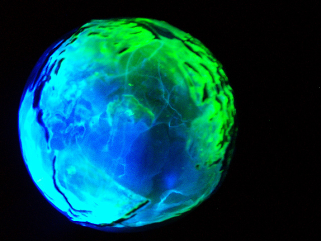
It is a great image, very bizzare looking and very much looking like a dynamic electric earth (which I see it was). It does look like a planet beseiged by storms, the veins of lightnening at the core seem to move even. The separation of green pn one end, blue on the other woth all the variations between sets up a nice contrast. I especially like that it seems to have a diagonal axis and you have tilted it towards the center of the picture along that axis. Makes a nice composition. I can't decide which I like better regarding the cropping. I think the close up crop makes the planet look more alive and swirly, where more of the black expanse of the universe around the planet might have made it look more like a planet out in space. Did you try it both ways.
Obviously you lost points for focus, out of focus seems to be an unforgivable sin here. How do you focus on a round object? It looks to me like you have focused on the lightening which is actually inside, right? So the surface is out of focus. But when I look at it as a planet I think the lightening is also on the surface and I find the out of focus mountains and edges disturbing. Could a deeper DOF have helped? I know you were outside at night and may have been limited to a wider aperature but maybe a narrow one and a longer exposure would have helped the focus......no wait....you needed the fast shutter speed for the crisp lightening. Obviously I know less than you do.
Overall I thought it was an interesting picture, thought provoking (is OUR plantet about to explode?) and I gave it a six (fell into the out of focus trap myself). |
|
 Photographer found comment helpful. Photographer found comment helpful. |
|
|
12/08/2002 09:02:30 PM |
I had a number of people ask me WHAT IS THIS ANYWAY?
You know those electricity balls that you can put your hand on and lightning bolts come to your hand? This is one of those, only in the shape of the earth, complete with bumpy mountain ranges, etc. I took it outside, draped it with black cloth, and took about 50 shots. I did a little sharpening, but not much. It looks fuzzy because it is a glowing ball, and it looks bumpy because it actually has bumps on it. Sorry, no mystery! |
|
Comments Made During the Challenge  |
|
|
12/08/2002 04:00:52 PM |
| That was one of the first things I had in mind for the blue challenge. But unfortunately I didn't have the possibilities to fly into space and take a photo of the earth ;-) Your "thing" (don't know what this could be) looks very interesting and I wonder how you did this. I'll check back after the challenge to see if you put any description on it. The focus could be a better. The photo looks very blurry and while I like this sometimes I think in this case it's not good. -stephan |
|
|
|
12/07/2002 08:00:27 PM |
| This is kind of intresting. |
|
|
|
12/05/2002 05:17:02 PM |
| I can't see any reason to be cropped off center. Decent job of making it look realistic. Don't like the green on it. It seems to be batteling the rest of the sphere for attention. Ok shot. PTL 5 |
|
|
|
12/01/2002 05:28:26 PM |
| Very interesting photo. Focus and lighting are good. Subject matter meets the challenge. 7 waltoml. |
|
| Photographer found comment helpful. |
|
|
12/01/2002 05:28:26 PM |
| This is really.... weird! What is it? I like the mic of blue and green, it works well, and the uncentred composition is good. Its so easy to fall into the trap on centering a single object. One gripe I have with this is that it isnt completly in focus. |
|
| Photographer found comment helpful. |
|
|
12/04/2002 04:56:17 PM |
| The blue glowing outline on the left is great. Overall a good job, but I feel the composition could be better for my tatste. I would like you to be a bit further out, so the planet could feel like it is hanging in space a bit more. The amount of black on the right seems a bit odd. I would want it either centered or to have more negative space on the right. I prefer the option with more negative space, but I feel both are a bit better than how it is now. |
|
| Photographer found comment helpful. |
|
|
12/03/2002 07:56:00 PM |
lol I have been criticising others for too much digital art and not enough photography... but hey, I LIKE your pic... good job.. heh
~anachronite |
|
|
|
12/03/2002 01:32:00 PM |
| Cool, but it seems so....lumpy? (prolly the narrow focus). 6 Swash |
|
|
|
12/02/2002 02:51:00 PM |
| Seems a bit out of focus. |
|
|
|
12/01/2002 11:46:00 PM |
| Nice shades of blue. A little unsharp though. |
|
Home -
Challenges -
Community -
League -
Photos -
Cameras -
Lenses -
Learn -
Help -
Terms of Use -
Privacy -
Top ^
DPChallenge, and website content and design, Copyright © 2001-2025 Challenging Technologies, LLC.
All digital photo copyrights belong to the photographers and may not be used without permission.
Current Server Time: 04/09/2025 04:34:34 AM EDT.