| Author | Thread |
|
|
07/28/2004 12:43:00 AM |
Greetings from the Critique Club!
...............................................................
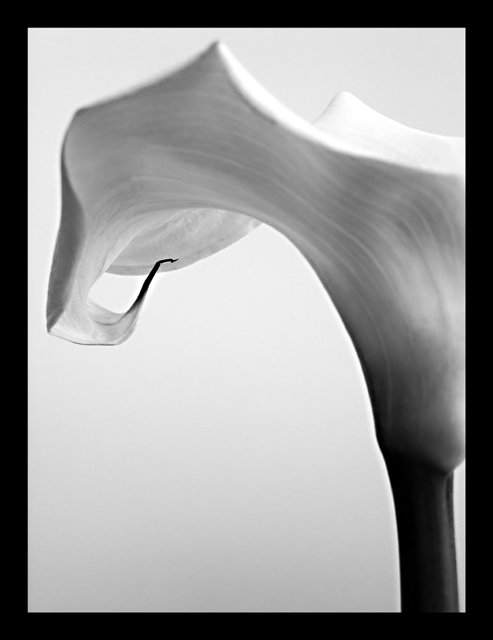
Beautiful form, lighting and focus makes this a very attractive image indeed. The composition is sound (perhaps a little too tight on the right) and the subject is indeed well balanced. Of course, nature so often is. The reason this did not score so well in the challenge is probably down to the fact that the shot does not sing of 'balance' per se. Most people would ask "I wonder what theme this represents?" if unaware of the challenge brief, and their answer may be 'Beauty', 'Grace', 'Form', etc.
If I was pushed for sugggestions to improve this I would have tried to achieve a longer DOF and increase the contrast between the background and the main flower itself. Also, given your explanation of its size, a suggestion of the scale might be good for your subject (but would not have helped your placing in this challenge) - and the border is definitely quite overpowering for such delicacy. |
|
Comments Made During the Challenge  |
|
|
07/25/2004 02:58:45 PM |
| one of my ribbon picks this challange == well done with the lighting and composition, really like how you've filled the frame (border is a bit thick, imho) |
|
 Photographer found comment helpful. Photographer found comment helpful. |
|
|
07/25/2004 10:06:09 AM |
| nice shot, would have liked a little more focus on the flower |
|
|
|
07/22/2004 05:43:31 AM |
| Without the title this doesn't represent balance at all. And with the title I still can't see much balance also the frame is a little bold. |
|
|
|
07/19/2004 06:58:26 PM |
| Very elegant subject with composition to match. I like the simplicity of this shot and how it implies balance using lines and shapes. One element I found distracting though is the robust border that seem to draw attention away from the main subject. That's only personal taste though, so great shot nonetheless. |
|
| Photographer found comment helpful. |
|
|
07/19/2004 10:51:58 AM |
| Like the tonal variation. Might look better with a thinner black grame. |
|
| Photographer found comment helpful. |
Home -
Challenges -
Community -
League -
Photos -
Cameras -
Lenses -
Learn -
Help -
Terms of Use -
Privacy -
Top ^
DPChallenge, and website content and design, Copyright © 2001-2025 Challenging Technologies, LLC.
All digital photo copyrights belong to the photographers and may not be used without permission.
Current Server Time: 04/07/2025 05:57:24 AM EDT.