| Author | Thread |
|
|
07/29/2004 09:34:32 PM |
Originally posted by Imagineer:
Hello from the Critique Club!
......................................................
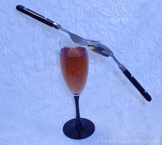
When viewing challenge images I like to see shots which work outside of the competition - normally a sign that it's a good shot regardless of votes. This probably suffers in that respect, mainly due to the skewed arrangement, blue colour cast and rather centred composition. The set-up clearly shows balance but it doesn't engage the viewer much beyond this, which ultimately is what may win votes.
I would ask; why the colour treatment and why the background? If it's difficult to answer then it's probably what many voters were wondering too. I would have chosen pure white or even a very dark colour and shot it from lower down, avoiding the shadows on the background too. This would demonstrate the balance element more dramatically. Since you can't easily hide the fact that the fork was tucked under the spoon, it could have looked more impressive edge-on (90 degrees).
Cheers
Jon |
Thanks for the Critique Jon. The reason I chose the background and the color, was because it covered up the crummy setup I had. I wanted a pure white background, but didn't have what I needed at the time. You're suggestion of a dark brackground and angle I could've done and I think it would have improved the shot a lot. Thanks again. |
|
|
|
07/29/2004 11:35:31 AM |
Hello from the Critique Club!
......................................................
When viewing challenge images I like to see shots which work outside of the competition - normally a sign that it's a good shot regardless of votes. This probably suffers in that respect, mainly due to the skewed arrangement, blue colour cast and rather centred composition. The set-up clearly shows balance but it doesn't engage the viewer much beyond this, which ultimately is what may win votes.
I would ask; why the colour treatment and why the background? If it's difficult to answer then it's probably what many voters were wondering too. I would have chosen pure white or even a very dark colour and shot it from lower down, avoiding the shadows on the background too. This would demonstrate the balance element more dramatically. Since you can't easily hide the fact that the fork was tucked under the spoon, it could have looked more impressive edge-on (90 degrees).
Cheers
Jon |
|
 Photographer found comment helpful. Photographer found comment helpful. |
Comments Made During the Challenge  |
|
|
07/25/2004 05:49:05 AM |
| clever set up, not a very interesting image |
|
| Photographer found comment helpful. |
|
|
07/23/2004 10:12:51 AM |
| This is a good idea. The image could be improved by correcting the white balance. The photo is way too blue. Also the composition coul be improved with a more "frontal" viewof the balacing utensles. To create a better effet the glass should also be straight. I hope this helps. |
|
| Photographer found comment helpful. |
|
|
07/22/2004 05:14:57 PM |
| Nice; I am enjoying the slight tilt to the shot, which makes the balance feel slightly off balance. Could be a little sharper, and I'd prefer a plainer background, which is just personal taste. |
|
| Photographer found comment helpful. |
|
|
07/22/2004 06:59:03 AM |
| This is a great idea but the colour seems off, unless you intended for it to look bluish. A white balance adjustment is called for here. |
|
| Photographer found comment helpful. |
|
|
07/21/2004 06:42:55 PM |
| Great idea not sure about the backdrop or table cloth or whatever, and the main subject does seem to need to be little sharper. |
|
| Photographer found comment helpful. |
|
|
07/19/2004 06:52:32 AM |
| The glass appears to be leaning to the left and the background is washing out any sparkle or life in the glass/liquid. Just looks flat. Good idea. |
|
| Photographer found comment helpful. |
Home -
Challenges -
Community -
League -
Photos -
Cameras -
Lenses -
Learn -
Help -
Terms of Use -
Privacy -
Top ^
DPChallenge, and website content and design, Copyright © 2001-2025 Challenging Technologies, LLC.
All digital photo copyrights belong to the photographers and may not be used without permission.
Current Server Time: 04/07/2025 01:01:25 PM EDT.