| Author | Thread |
Comments Made During the Challenge  |
|
|
10/07/2010 05:54:33 PM |
| I don't like the tone here. Nice composition though... 4 |
|
 Photographer found comment helpful. Photographer found comment helpful. |
|
|
10/03/2010 09:52:54 AM |
| The yellowish tint to this is kinda off putting to me. I would Love to see the origional, However that being said I still think it's an outstanding Photo! |
|
| Photographer found comment helpful. |
|
|
10/03/2010 08:49:57 AM |
| I like the way it creates the diagonal. |
|
| Photographer found comment helpful. |
|
|
10/01/2010 11:25:53 AM |
| Good positioning of the focal point but for me, the tinting lets the image down, hope you do well with it |
|
| Photographer found comment helpful. |
|
|
10/01/2010 09:21:16 AM |
| not liking the yellow tone in this |
|
| Photographer found comment helpful. |
|
|
10/01/2010 03:36:55 AM |
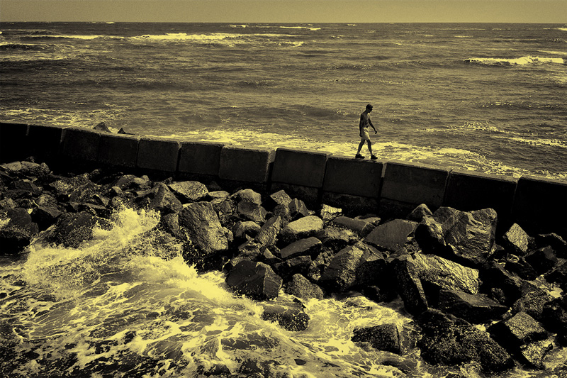
I'm going through the entries, stopping at those images I feel have had the benefit of an unconventional eye and dwelling a little longer to try to see and appreciate what you saw. This is one of those images.
Positives:The overall composition of the image is very sound and the included elements are effective at telling a story. The rocks in the foreground appear sufficiently treacherous to suggest your subject is in some jeopardy here.
Critical stuff: I'm not at all convinced by your toning choice here. I think a more straight-up monochrome or even a muted colour presentation may have worked a little better.
Overall: An effective image, but for me a sub-optimal presentation. |
|
| Photographer found comment helpful. |
Home -
Challenges -
Community -
League -
Photos -
Cameras -
Lenses -
Learn -
Help -
Terms of Use -
Privacy -
Top ^
DPChallenge, and website content and design, Copyright © 2001-2025 Challenging Technologies, LLC.
All digital photo copyrights belong to the photographers and may not be used without permission.
Current Server Time: 04/09/2025 07:45:04 PM EDT.