| Author | Thread |
Comments Made During the Challenge  |
|
|
09/28/2010 03:49:46 PM |
| Wonderful neon lit noir.In my top eight of the challenge.9. |
|
 Photographer found comment helpful. Photographer found comment helpful. |
|
|
09/28/2010 09:35:13 AM |
My second-to-top pick* in this challenge.
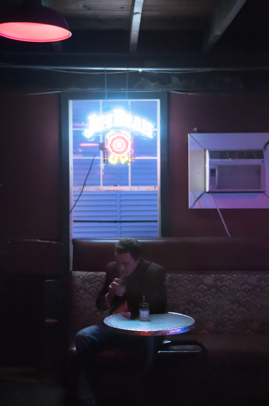
I liked the array of seedy objects orbiting this guy: he fits right in. I liked the awful colours. I liked the mood: cheap, nasty and unrefined ... much like the eponymous Jim Beam. All in all, a terrific little vignette.
* I actually know who took my number one pick in this one, so I can't comment on it. But you were a very creditable silver medallist for me, and if that other person should fail a post-race drugs test (as is entirely possible) you'll move to the top step on the dais. |
|
| Photographer found comment helpful. |
|
|
09/28/2010 02:54:05 AM |
| Photograph passes for a portrait but I miss the chair in this story. Or in better words, I don't see any chair adding to the story. |
|
| Photographer found comment helpful. |
|
|
09/27/2010 11:01:00 PM |
| i'd like to like this because it is outside the boxish but nothing in it grips me - even the spare glass of milk with a straw |
|
| Photographer found comment helpful. |
|
|
09/22/2010 01:42:38 AM |
Wow...this scene has so much potential but sooo many pitfalls to overcome. I think the first item of interest is the Jack Daniels sign. We want that nice and clear. Its a little overexposed and fuzzy. If you shot this with a smaller aperture (I am guessing you shot this wide open) and actually under exposed a bit we'd see the colors better and it would be clearer and a lot sharper.
The light from the sign is spilling nicely onto the table. Again, underexposing a little bit would allow those colors to come through better.
The subject? Well..he's soft and I think thats just because of missed focus. Unfortunately he's too under exposed and if we under expose everything else he'll be even more so. (See what I mean by pitfalls?) So we can't rely on the ambient light to light him up. We might be able to reflect some of the sign's light at him but I don't think its going to be enough. So we need flash. It doesn't need to be a lot but just one flash shaped to just light him and bench a bit then fall off. We definitely don't want it to hit the table because that would kill those cool colors that are reflecting off the edge of it. Maybe we gel the flash to warm it up and get a nice contrast to the cool light from the sign.
The ceiling light could go. Maybe crop it out because its not really adding anything to the scene. I wish we could get rid of that air conditioning unit but its photography not home renovation after all :)
I'd have to say that this was definitely a shot worth trying and maybe even revisiting. |
|
| Photographer found comment helpful. |
Home -
Challenges -
Community -
League -
Photos -
Cameras -
Lenses -
Learn -
Help -
Terms of Use -
Privacy -
Top ^
DPChallenge, and website content and design, Copyright © 2001-2026 Challenging Technologies, LLC.
All digital photo copyrights belong to the photographers and may not be used without permission.
Current Server Time: 02/01/2026 10:11:48 AM EST.